Hi everyone, today we continue our journey into the world of section dividers but this time we want to deep the css clip path topic and see how this can work for our purposes. So let’s get started!
THE CLIP-PATH CSS PROPERTY
The clip-path css property is a magic one that let us to clip everything we need in the shape we want; and to get the result – of every complex shape we can imagine! – we just need of few lines of css. Starting from Mozilla Developer Network:

The clip-path CSS property creates a clipping region that defines what part of an element should be displayed. Those portions that are inside the region are shown, while those outside are hidden. The clipping region is a path specified either as a URL referencing inline or external SVG, or as a shape, such as a circle() .

And without go too deep in the property syntax the basic structure we need will be something like this:

PROPOSAL : THE MAN IN THE HAT
We start with a funny example, the man in the hat. No, it’s not the Sherlock Holmes funny hat, but it’s still fun how this element can play between our sections. So we go step-by-step.
1 – ADD TWO SECTIONS

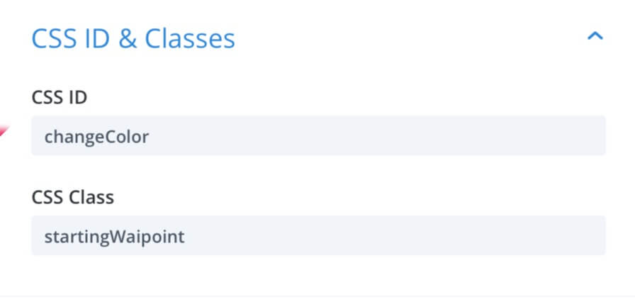
First of all – is quite obvious – we have to create our two sections of different background colors (in our case we opted for a light grey for the above section and white for the below one). Then we open the Section Settings -> Advanced -> CSS ID & Classes and we add ‘startingWaypoint’ as class and ‘changeColor’ as css Id (we will need these ones later on).

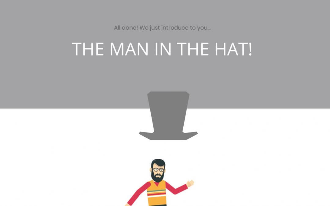
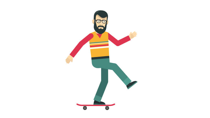
2 – THE MAN IN THE HAT

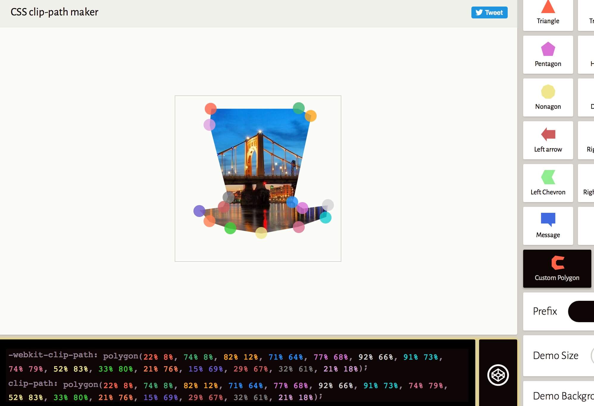
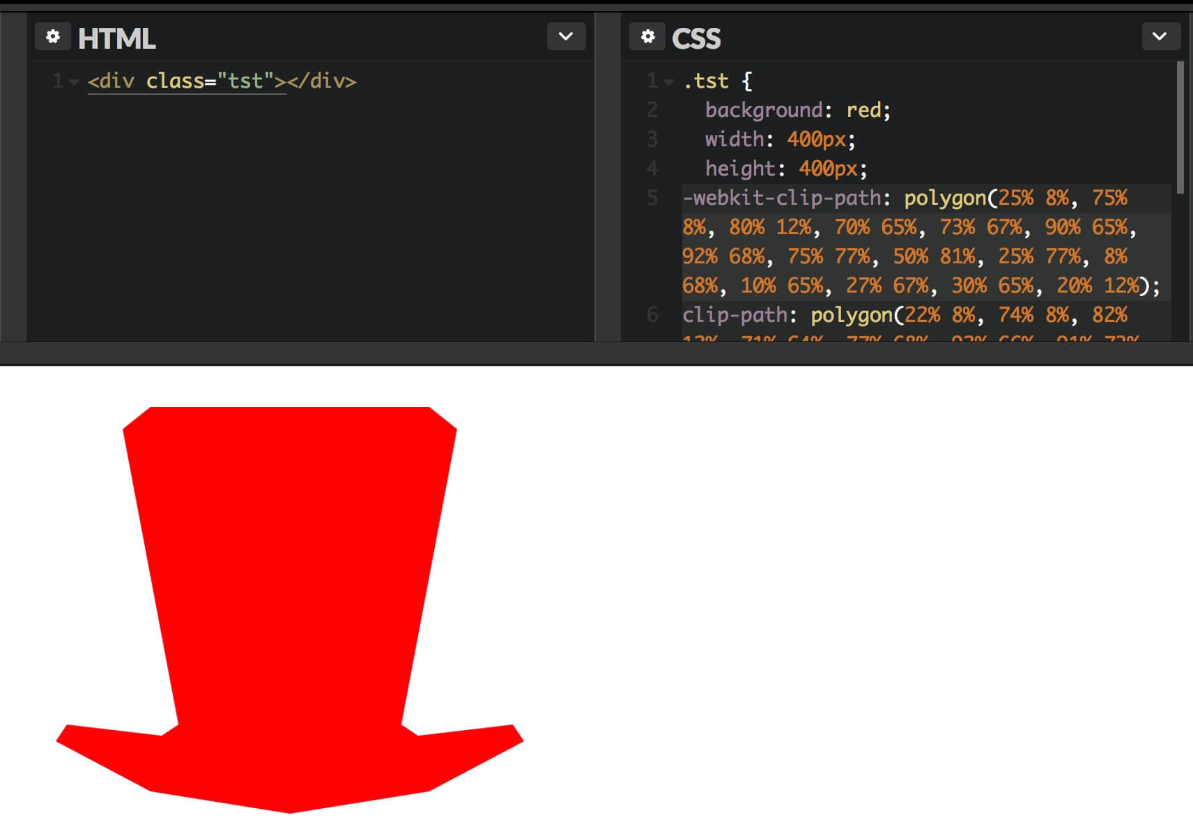
It’s time to call the man in the hat. So we add the man image in the section below (centered) and then we go to create our hat with only clip-path property and few lines of additional css to adjust the position and the color. We have already seen how simple is to create a clip-path shape in theory, we are in a Cartesian coordinate system and every single point is represented in a couple of percentage values, the x (vertical) and y (horizontal) axes. So if we have to create a simple square we just have to add four points in this way: clip-path: polygon(0 0, 100% 0, 100% 100%, 0 100%). However in our case we need a much more complex shape like an hat and building alone our coordinate system could be not easy at all. Fortunately there are some web (free) services that come in our aim: probably the most useful in absolute is Clippy. From here you can select the Polygon shape and then add how many points you want seeing live how your shape comes to life.

We still need, however, a little aim cause we are not Giotto. So we can simply click on the Codepen symbol on the right of your clip-path code; then you can create a simple html element, assigning to it a css class and then copy and paste your clip-path code in the css box for working on it and adjusting so the clip-path values to get your final result.
Once we have our final code we simply create a one-column row in our above section, go to Settings -> Advanced -> Custom Css and paste the clip-path code together with other few lines of css in the ‘before’ box.

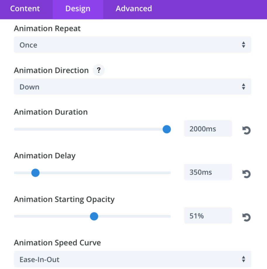
3 – IT’S TIME TO ANIMATE

So it’s time now to animate our hat. We go to the hat row Settings -> Design -> Animation and we add a Bounce effect with the following parameters:

This part is really simple thanks to the magic of Divi new Animation features! However we want also to add another little animation to change the background color of the above section in a way that it can match the color of the hat after few seconds so that the bottom of it will become the section divider itself. In order to do that we have to: 1) Add the following css in Divi Theme Options -> General -> Custom Css (or also in the Page Settings of your post if you need it just in this one):
2) Add the following jQuery script in Divi Theme Options -> Integration -> Head (or also to the Bottom of your posts if you need it just in the posts): Note: In order to make start the animation exactly when the user reach the section view (with an offset of 40% in our case) Divi and we use the jQuery Waypoints library of which we already wrote some posts ago here. Give a look to deep this topic!
All done! Now simply watch your work in action!
All done! We just introduce to you…

THE MAN IN THE HAT!

FINAL THOUGHTS

Well, we are at the end of our design proposal. And as we always remind you, the possibilities are really endless and this idea is just a draft to give you some possible scenario to be developed much more accurately than we did in this example. Hope it could very useful, see you next friday post for another animated css section divider proposal. Cheers!

SupportHost

You have Successfully Subscribed!

CodeCanyon Plugins

You have Successfully Subscribed!

Elegant Themes

You have Successfully Subscribed!

Try Divi!

You have Successfully Subscribed!

Divi Plugins

You have Successfully Subscribed!

Advanced Blurbs Plugin

You have Successfully Subscribed!

Bloom!

You have Successfully Subscribed!

Divi Cake Layouts

You have Successfully Subscribed!

Divi Cake Plugins

You have Successfully Subscribed!