Today we want to start our Divi insights on a great – and sometimes underestimated – design topic on which one of the last Divi Feature Update has been focused: Divi Backgrounds.
So let’s get started!
DIVI Backgrounds - The Basics
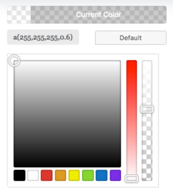
One of the most appreciated Divi features from the beginning of Divi itself was the attention paid to the graphics and design in each module. However till June 2017 the background options were just to choose the color in its normal or alfa transparent variable.
Every other customization was delegated to the Custom Css panel in which we were able to free our creativity...
DIVI Backgrounds - Recent Updates
On May 31 Nick of Elegant Themes Divi Theme has launched a new Divi Feature Update: the Divi Backgrounds.
NEW OPTIONS PANEL
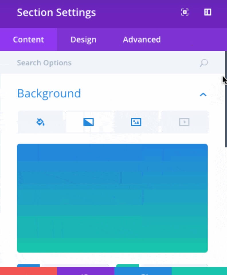
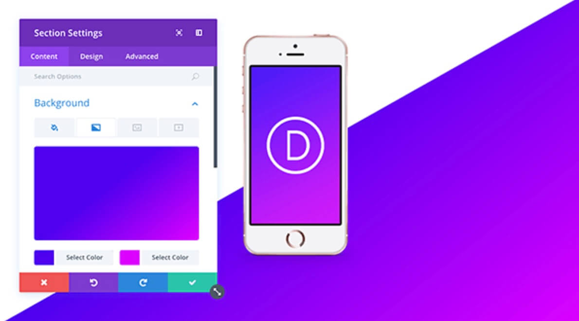
A brand new Background Options panel has been launched, a nice and clean interface from which we can set the background color (as before), but also make use of Gradients (we will see it in a minute), background Images with new and wonderful Blend options and also Video backgrounds.
IMAGINE
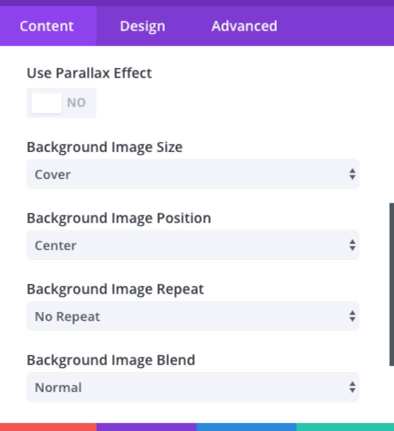
Imagine, or just remember, how many times we should write and rewrite custom css code and update the post (or preview it) in order to see if the final result is exactly what we expect... Well, now all you have to do when you're working on Image backgrounds is set the image from the new Options Panel, select the options you need (Parallax or Image Size and Repeat) and then free your creativity with Blend options!
DIVI Backgrounds - Gradients
DIVI GRADIENTS
Divi Gradients is a new important feature for your designs, it let you to save a lot of times and get better results with the unquestionable advantage of see in real time the effects you're adding to your backgrounds.
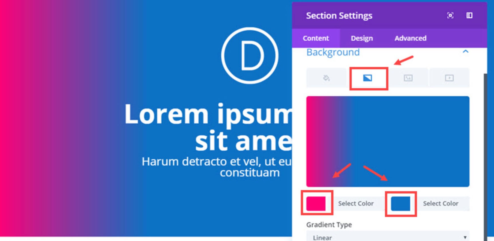
Gradients became a Trend in the last few year in the Css world, they are simply a fantastic way to give character to your background colors and make them stand out from the crowd. How they work? The basic concept is really simple: just select two colors as a starting and ending point respectively and the gradient will output for you the color range in between!
DIVI Backgrounds - Shapes and Blends
DIVI BLENDS
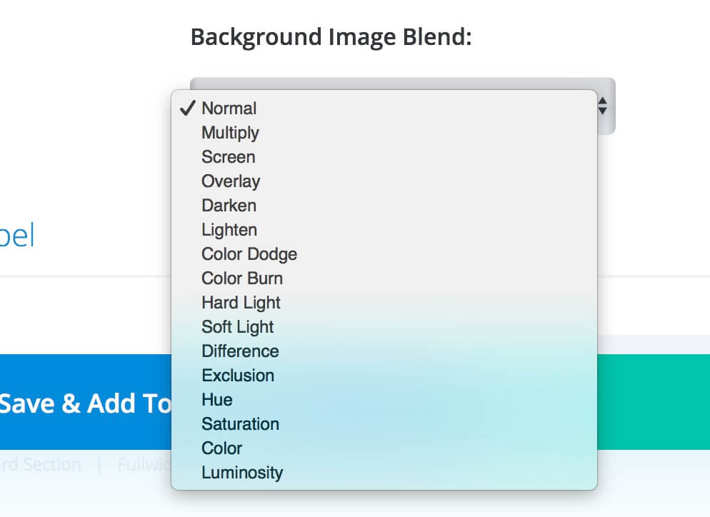
With Gradients is certainly the most interesting new feature introduced, we are talking about the Divi Blend option that come together with Image option panel.
DIVI Backgrounds - How i Divi-t
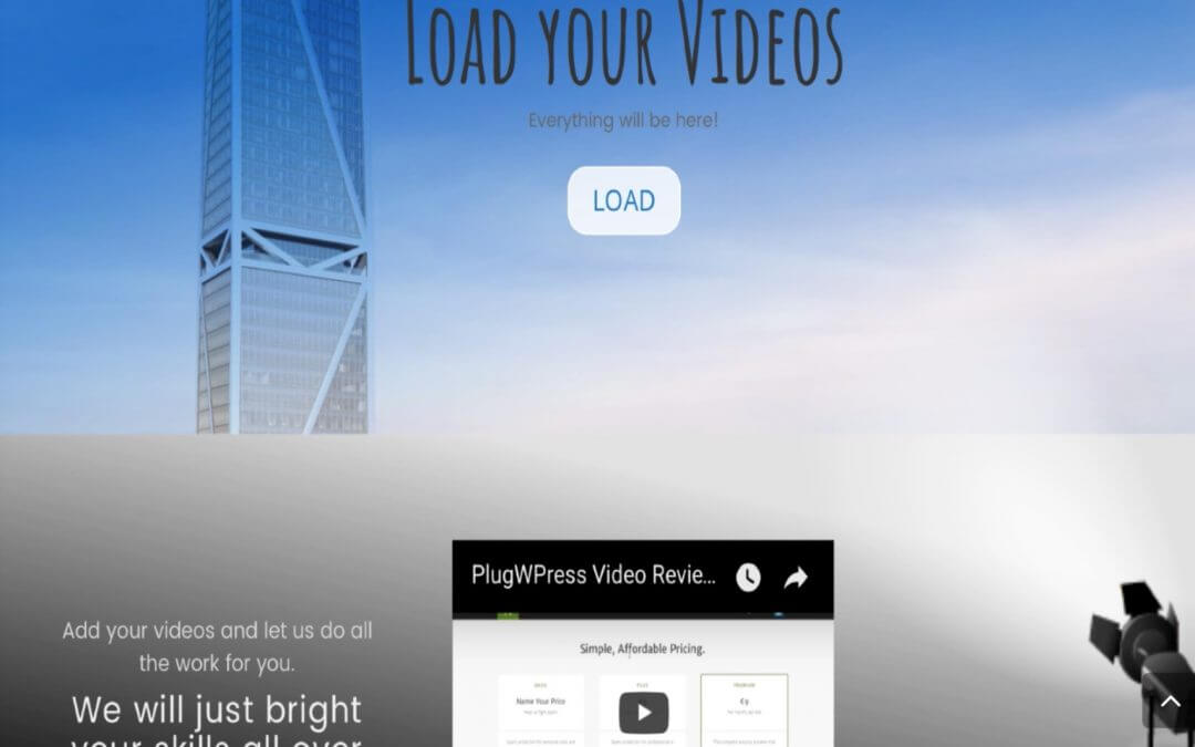
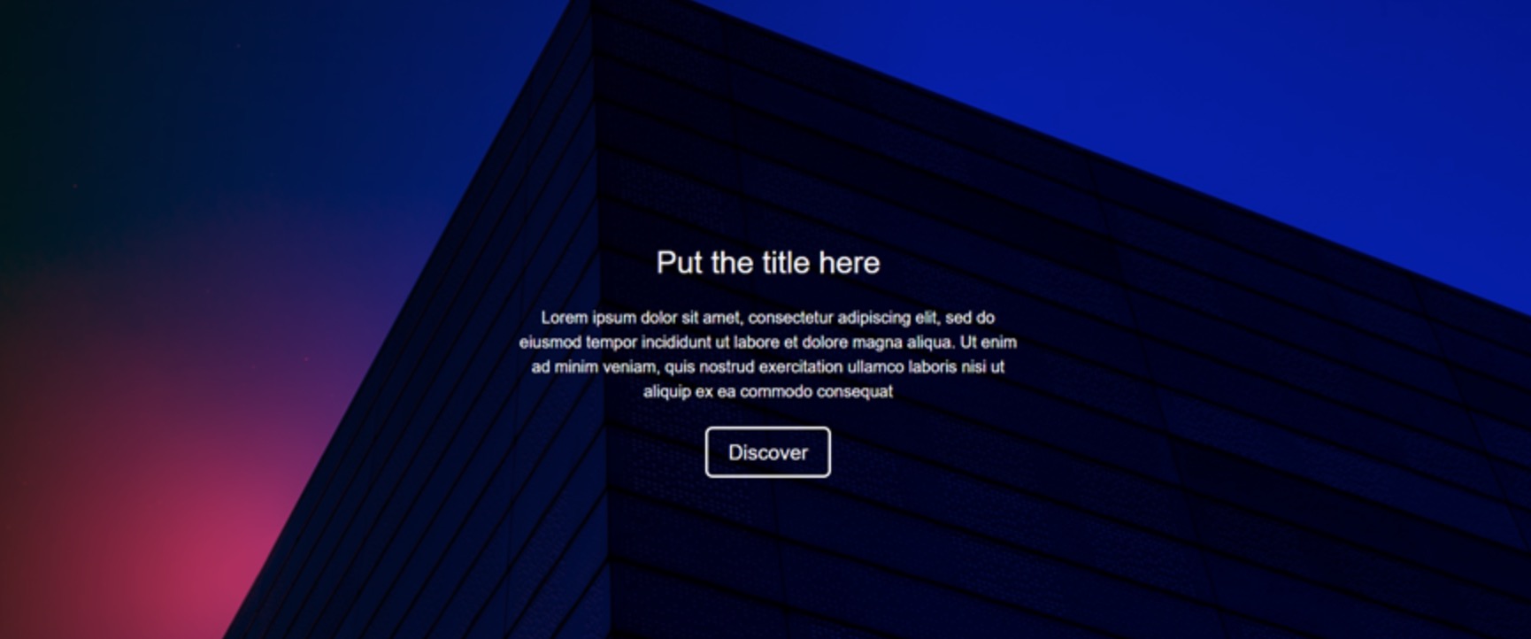
Ok, let's deep now in the How-I-Divi-t section and explain step-by-step how we get the result you can see above.
SET the Hero SECTION
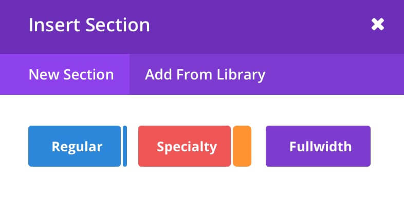
1 - First you have to create a new Regular Section.
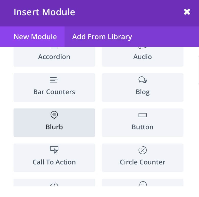
2 - Then we'll select Blurb as new Module to add in our section.
P.s. You can of course select every other module to customize your hero section as you want 😉
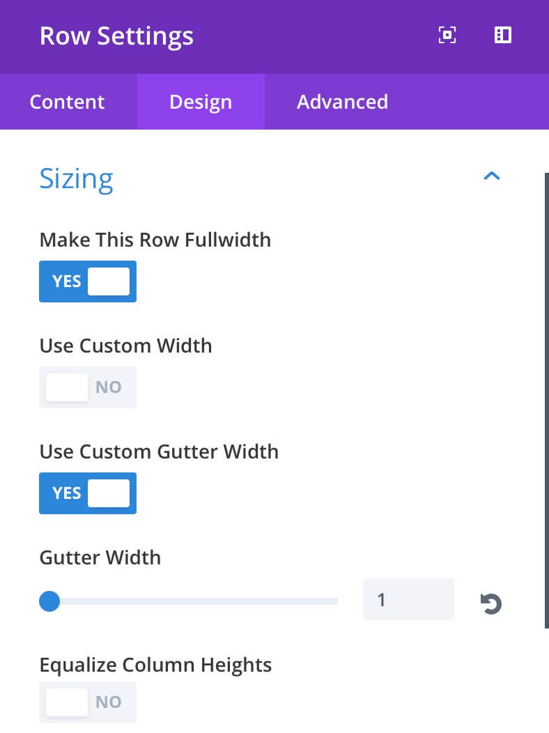
3 - Ok, now we have to set some parameters in our Section Row Settings.
Be sure to Make the row Fullwidth and also to set a Custom Gutter of value 1 as you can see in the image, so you will get your section covering all the space available from left to right.
Now, before to pass over on Background's options let's set the Blurb, a little Copy and the Button...
BLURB and BUTTON
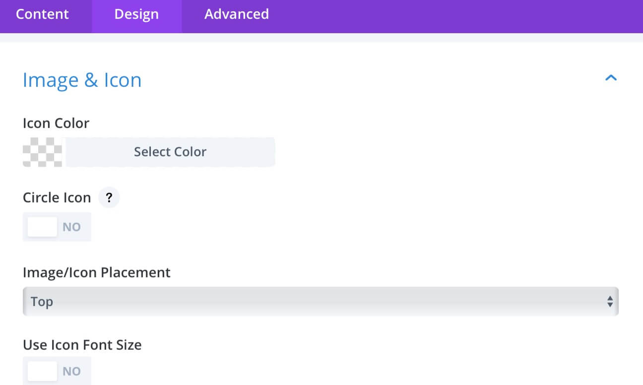
1 - Let's begin with the Blurb. We'll go in the Design tab and we'll select the white transparent Icon Color: rgba(255,255,255,0.34).
Then simply go in the Content tab and choose the Icon.
Finally, set a Title, a Text and Center it.
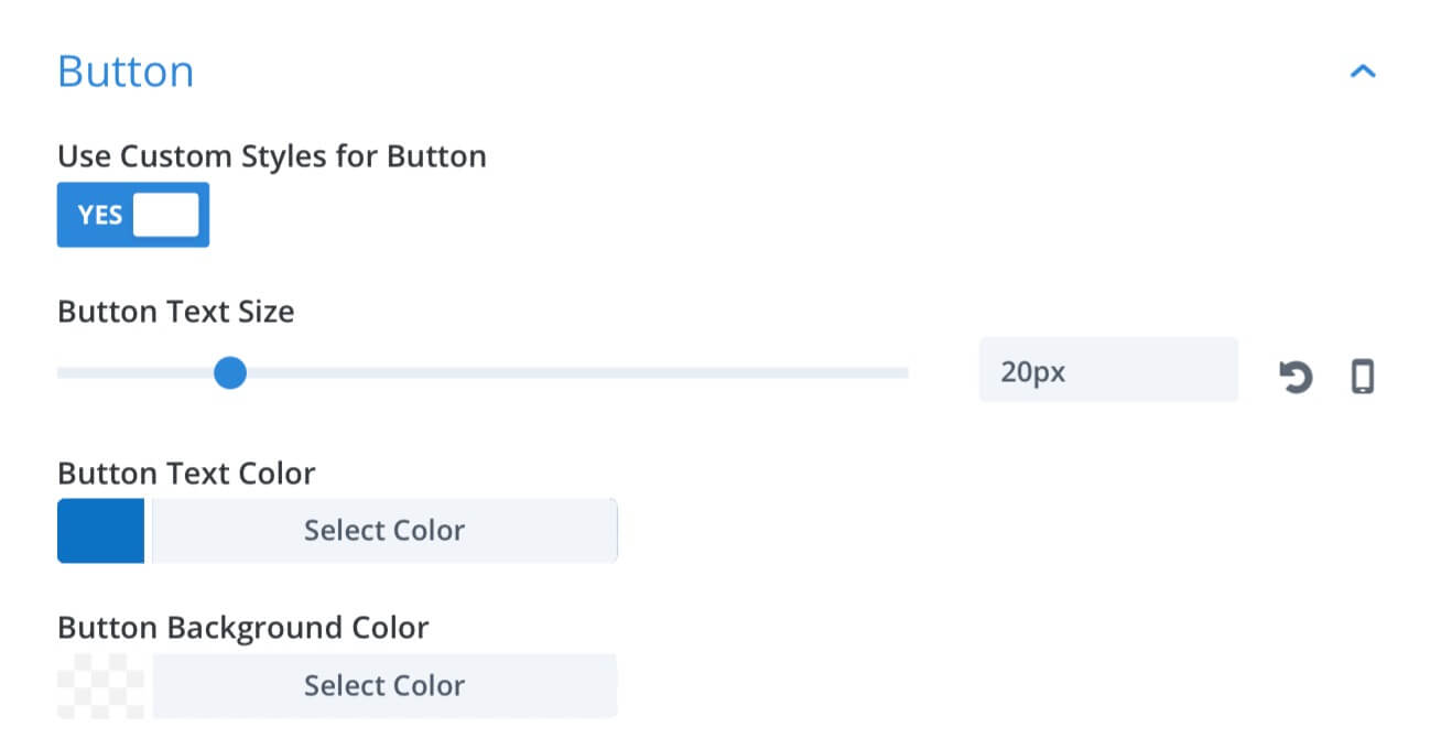
2 - Then coming to the Button: create a new module just below the blurb, go to Design and select Use Custom Styles.
- Button Text Size: 20px;
- Button Text Color: #0c71c3;
- Button Background Color: rgba(255,255,255,0.79);
- Button Border Width: 1px;
- Button Border Color: White;
- Button Border Radius: 16px;
- Add Button Icon: No;
- Button Hover Background Color: rgba(0,0,0,0);
- Button Hover Border Radius: 3px;
Last step before the Background we have to create another section below so that the hero section will have a lot more characther and originality... let's give it a quick look!
The Second Section
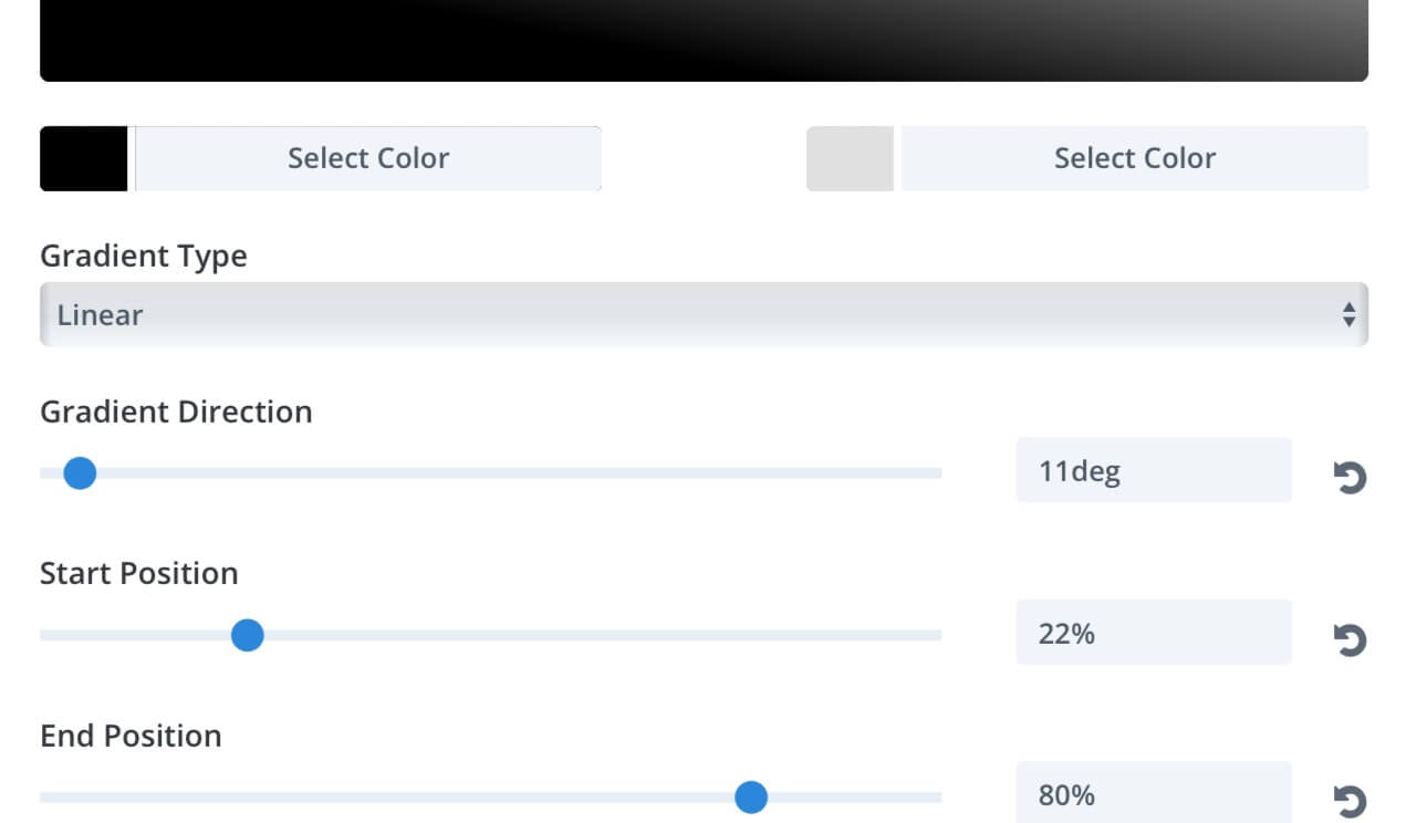
Then we'll set:
Gradient Type: Linear;
Gradient Direction: 11deg;
Start Position
: 22%;
End Position: 80%;
1 - In this case we will create a similar section and we'll set a Background in the Section Row Settings by clicking on the second Gradients tab and choosing the colors:
Start Color: #000000;
End Color: #e0e0e0;

Essentially we have a three column layout with a Copy on the left, then a Video and an empty text module (if you want recreate a perfect copy of our layout you can download it at the end of the post).
2 - So let's switch for a moment to the Wireframe View (another great recent Divi Feature Update) to give a look to the structure of this section.
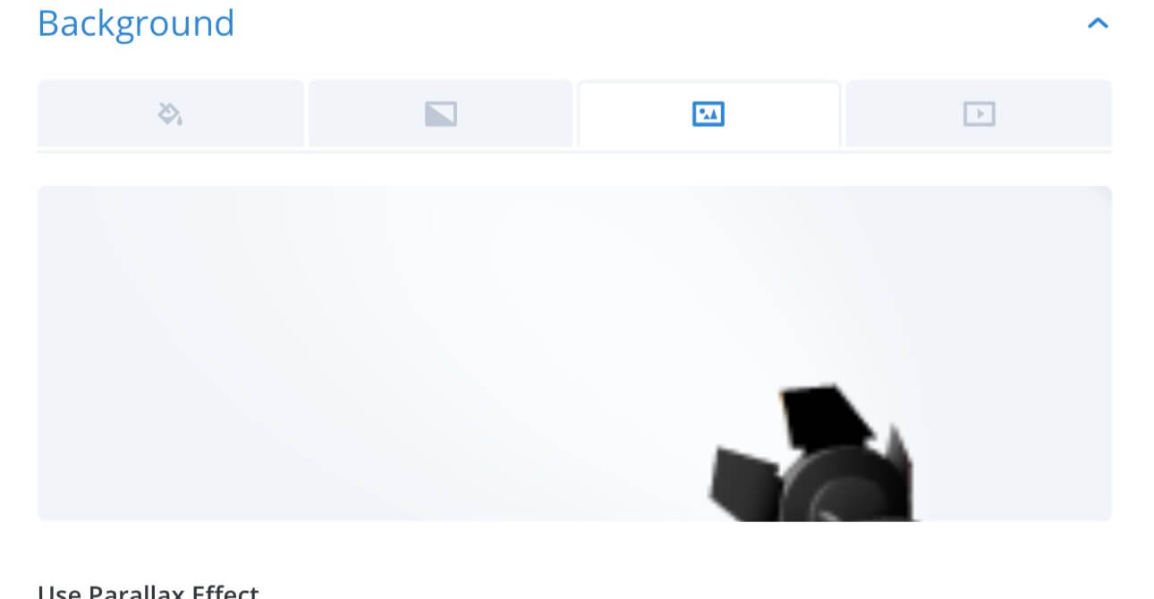
3 - In the last Text module we can use another option tab of the new Background Panel.
We'll select the third tab and we'll upload an image as a background.
Ok, now we can really dive in the Background Options... we will create a gradient background that fits with the section below with the goal of get a final layout resembling a reflector that lights our hero section and especially our Blurb module.
The Magic of the BACKGROUND Options
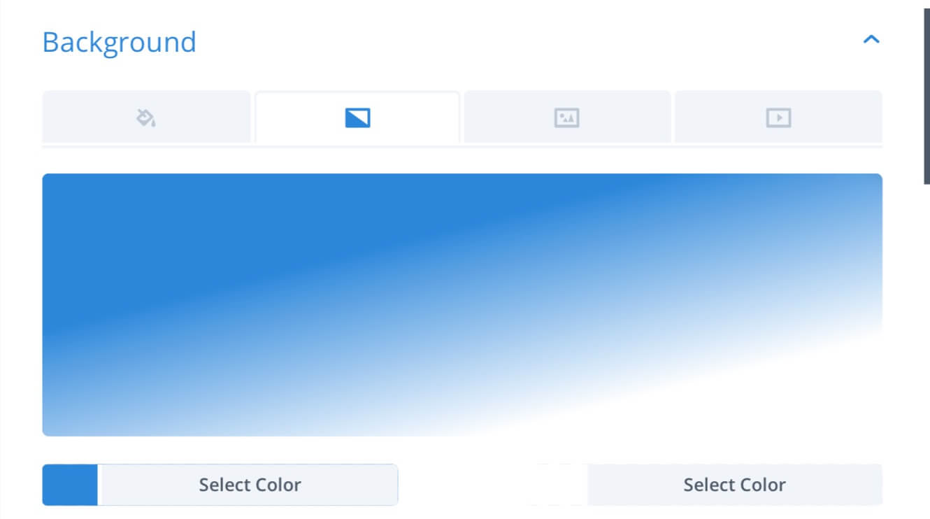
1
- First of all, go in the Section Settings, select the Gradient tab and choose the colors:
Start Color:
#2b87da;
End Color: #ffffff;
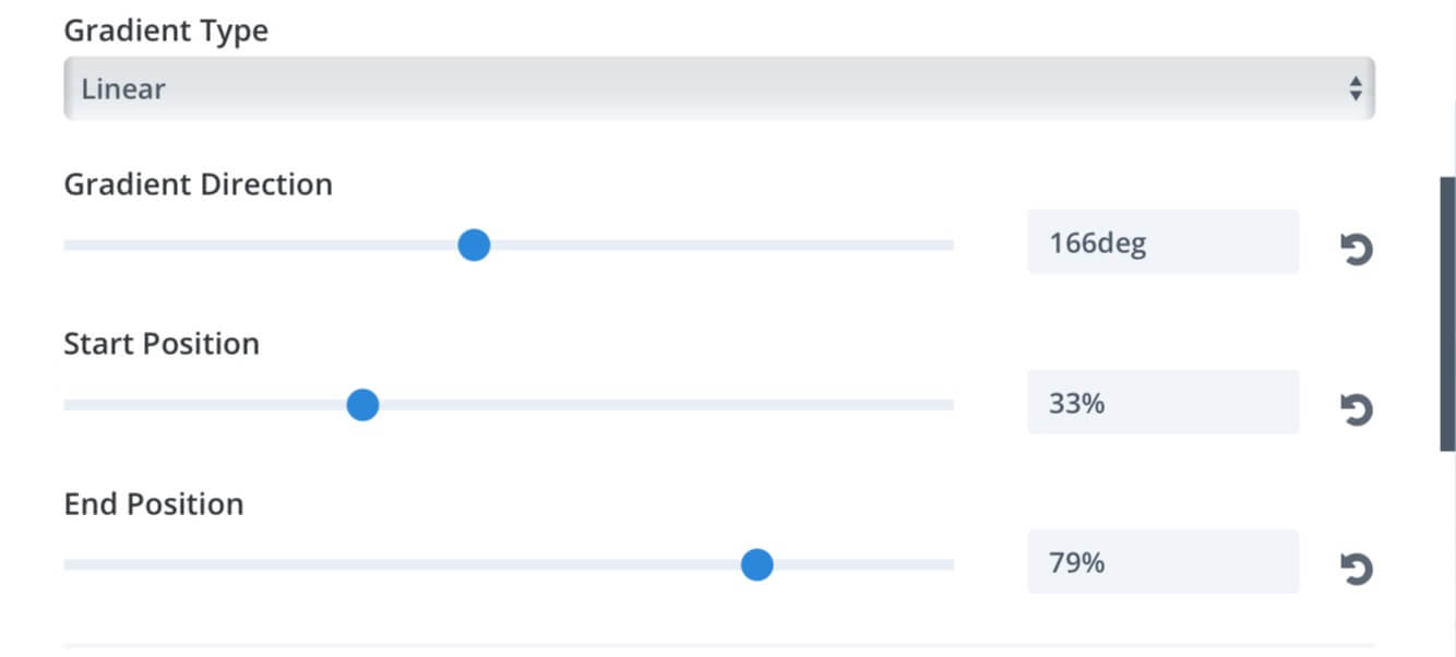
2 - Then passing to set:
Gradient Type: Linear;
Gradient Direction: 166deg;
Start Position
: 33%;
End Position: 79%;
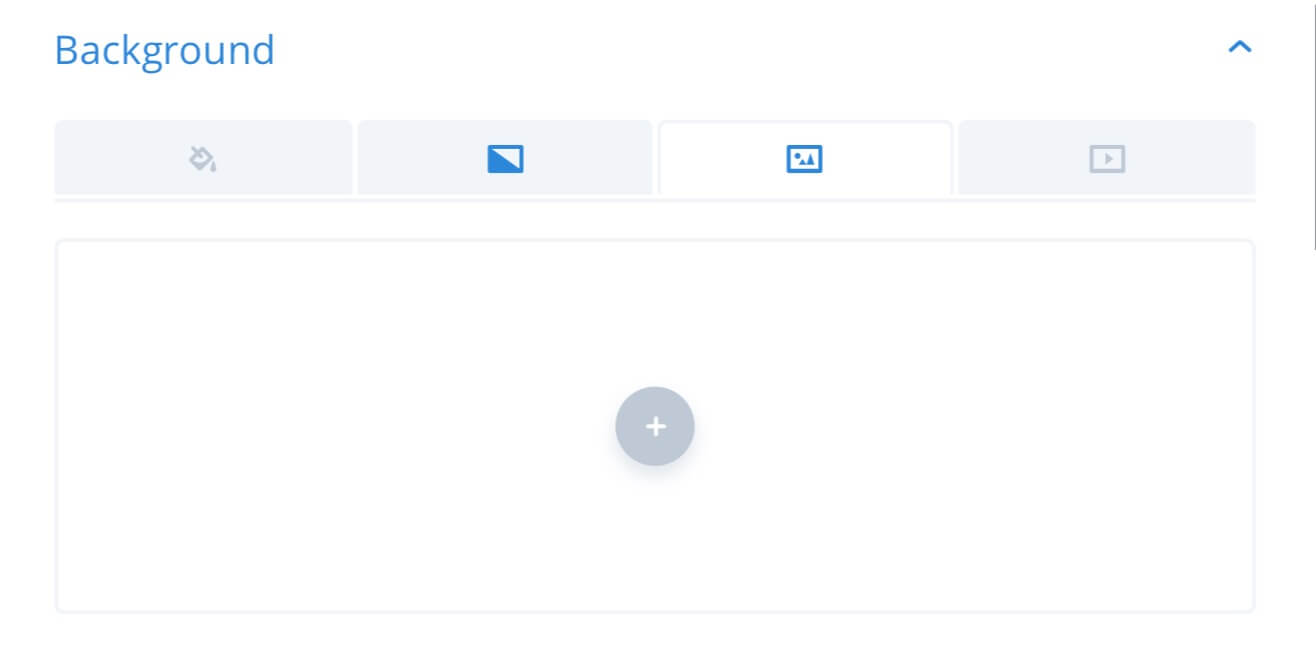
3 - Ok, now switch to the Image tab and upload the background image...
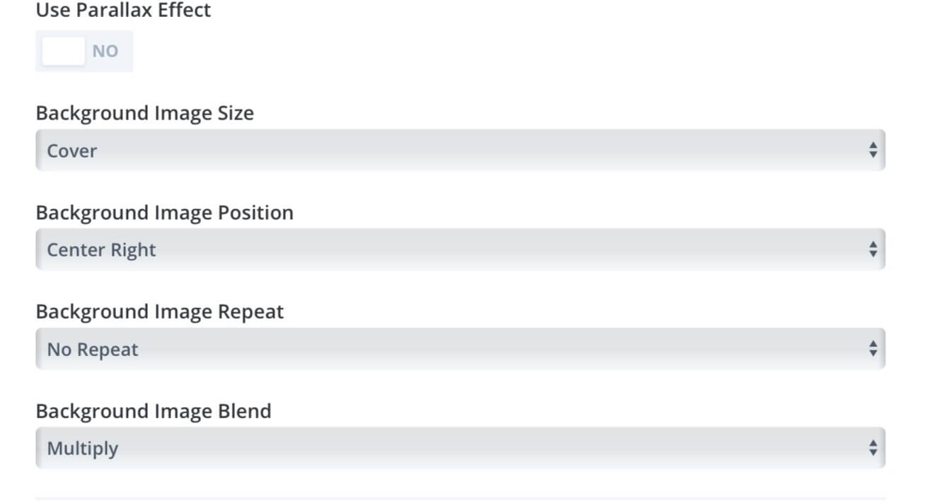
4 - And finally we have to set the following Image parameters:
Background Image Size: Cover;
Background Image Position: Center Right;
Background Repeat: No Repeat;
Background Image Blend: Multiply;
So we are at the ond of the post. I hope you’ll find it a little bit useful even though this post can obviouly only give you a quick look to the endless possibilities of Divi and Divi Background new updates in particular. Thanks for reading. We’ll see the next post!

