Our final result, thus, will be the following.
Something strange?
So, let’s get started!
First of all let’s create a new toggle module inside a section. Then simply style and customize the module as you want.
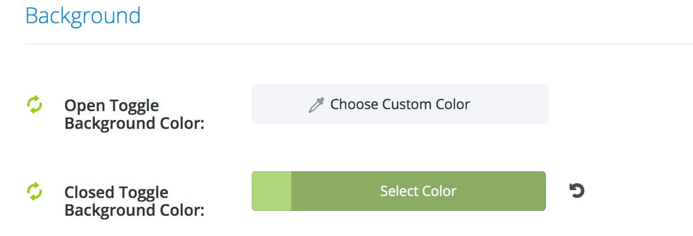
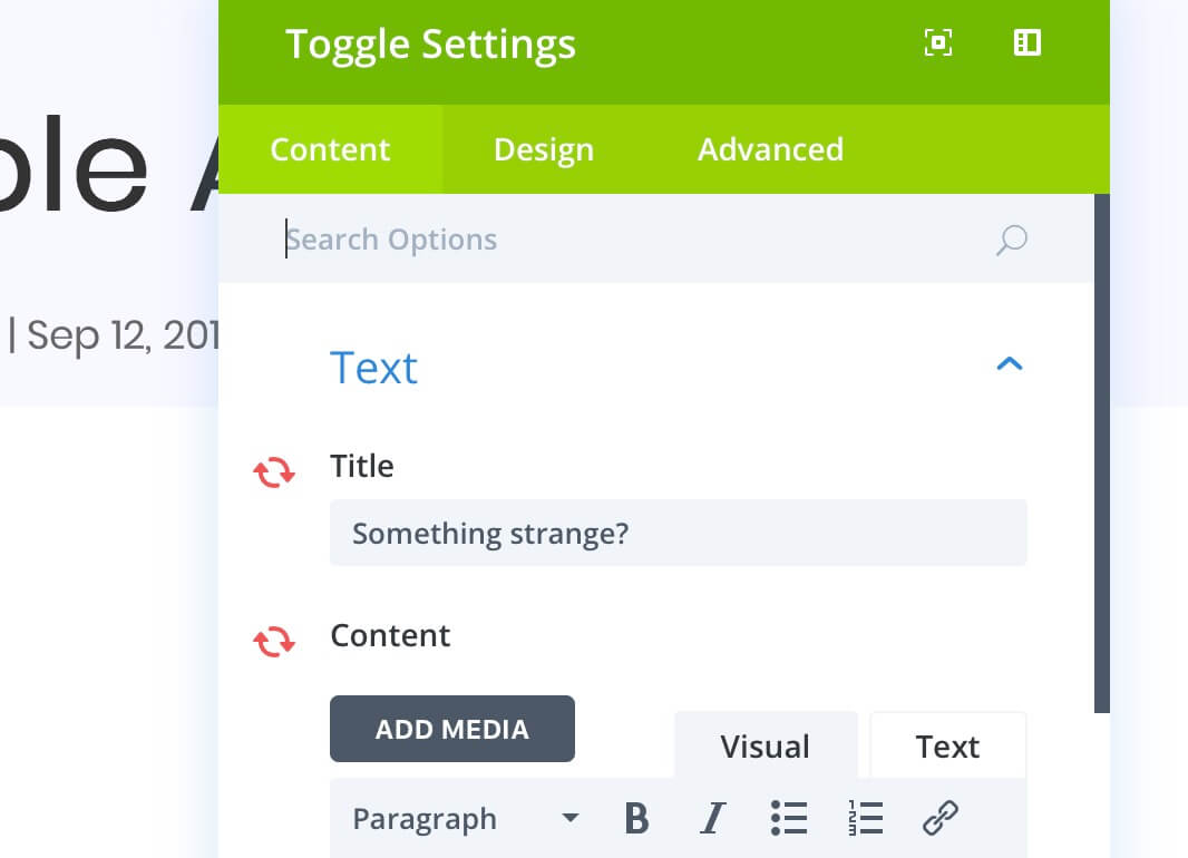
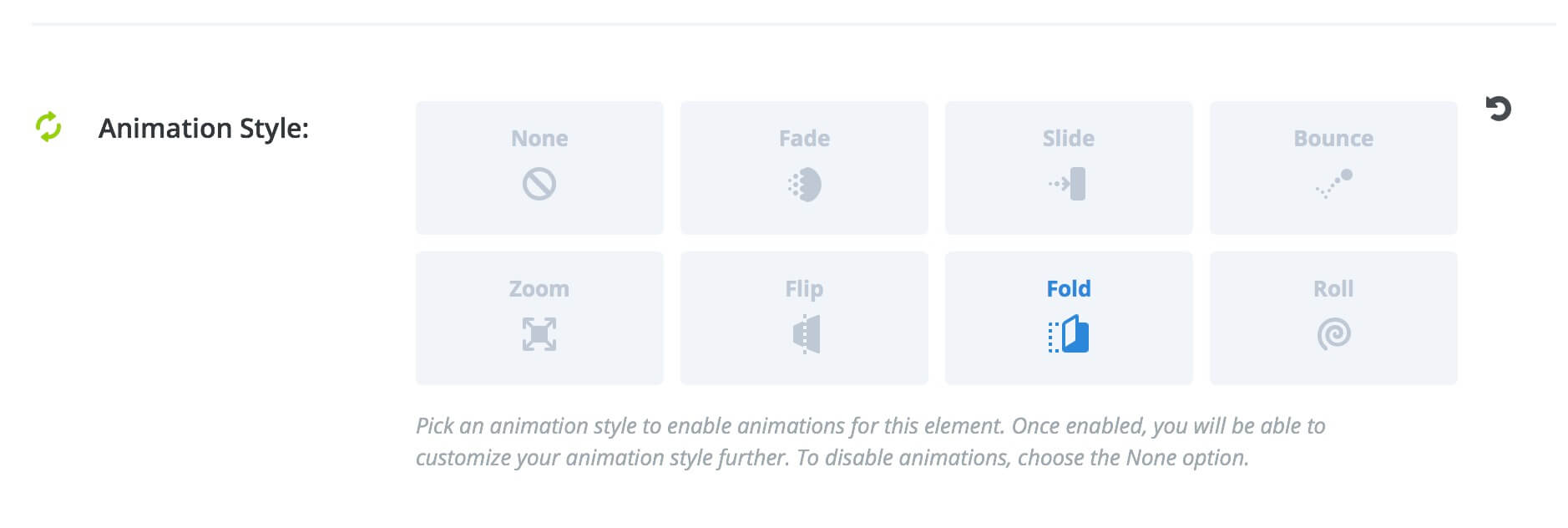
In our case we set a light green background for toggle when it is closed, then we styled the title text and the icon with white color. Then we have saved the module as Global module and, thus, we made unsynchronized the module Title and the Content. Finally, we chose a foldLeft simple animation.
First we have to set our Row Css Class.
Go into Row Settings -> Advanced -> CSS ID & Classes and add the Class: “toggleTips” (or whatever you want).
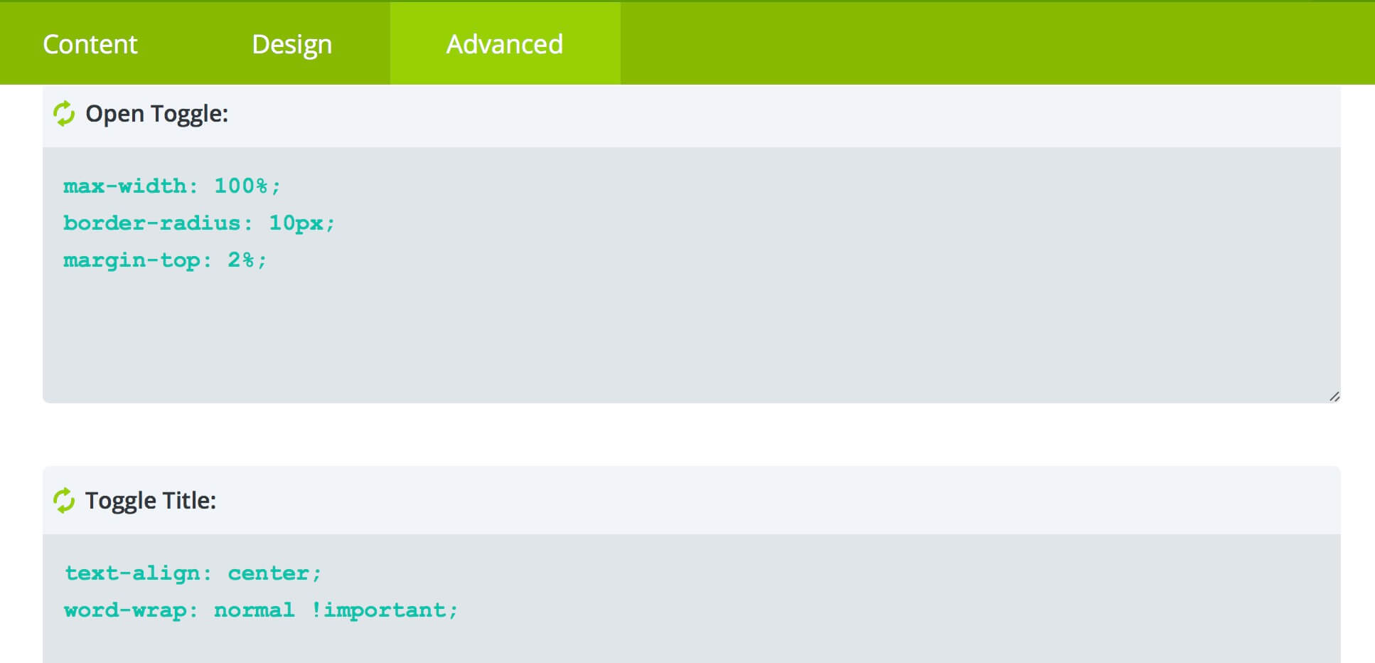
Then we have to add some Css directly in the Module Options.
So, let’s go to the Module Settings -> Advanced -> Custom Css and add some code in Main Element, Open Toggle, Toggle Title and Toggle Content respectively.
Finally we go into Divi Theme Options -> General -> Custom Css and add the following code.
FINAL THOUGHTS
So, is very very easy to get the result and the effect can be very nice in some situations. It capture the user eye and is also a useful element that can help the user without overwhelm too much the entire layout design.
See you next post.
Cheers!




hi, thank you for the tutorial. it seems the toggle in my case can only open the content downwards not side ways. as i want it to open sideways from left to right.
Hi Lucas, it could maybe depend from the toggle alignment. In my case i have set the module alignment to the right and when you open the toggle it stretch to left (in the same way if you align it to the left it will stretch to right). Are you sure you have not aligned the module at Center? Because in this case it would stretch mainly downwards.
Let me know if this is not your problem.