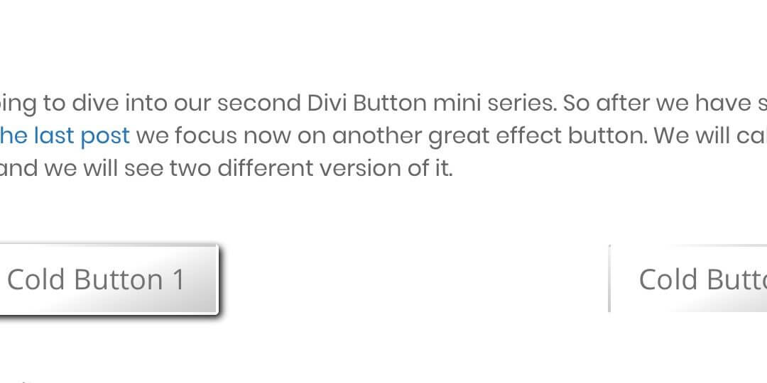
Today we are going to dive into our second Divi Button mini series. So after we have seen how to make a ripple button in the last post we focus now on another great effect button. We will call this kind of button, the cold button and we will see two different version of it.
So, let’s get started!
First of all we have to add our Divi Button module in our page layout; write our Button Text and then pass to the Design options tab. The first thing we will do will be set the button alignment.
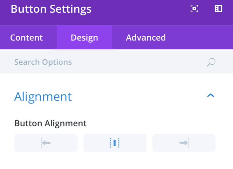
Then, we will set our Button style using custom parameters like following…
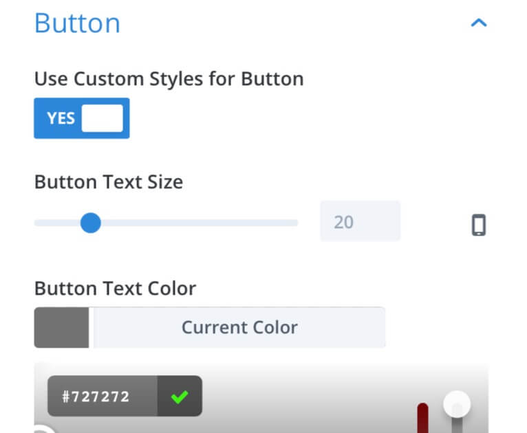
– Switch on the Use Custom Styles
– Then set to #727272 our Text Color
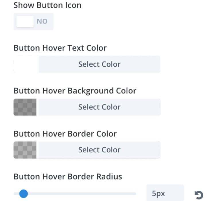
– Switch off the Show Button Icon
– Set to White our Hover Text Color
– Set to rgba(114,114,114,0.76) our Hover Background Color
– Set to rgba(130,130,130,0.62) our Hover Border Color
– Set to 5px our Hover Border Radius
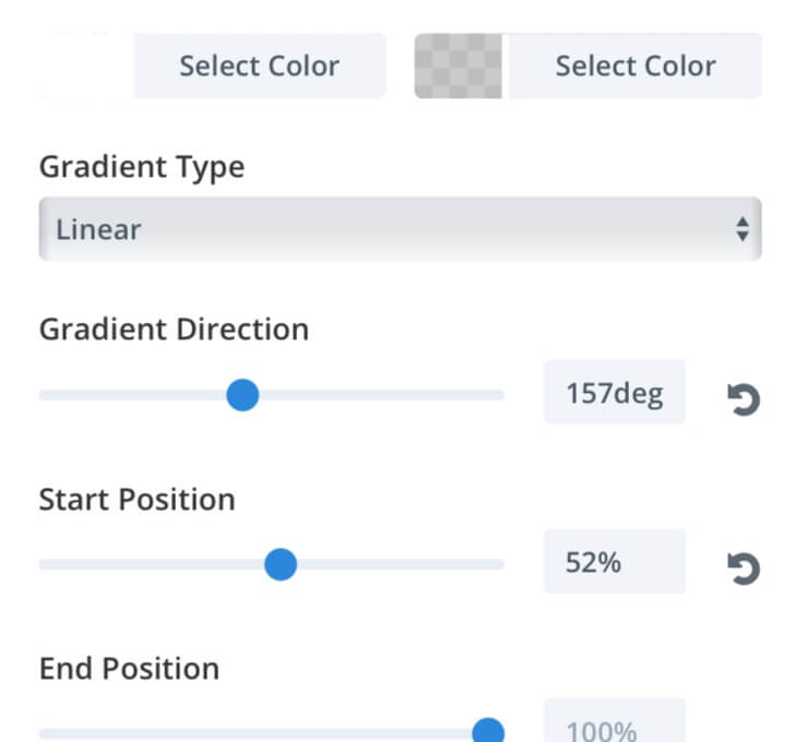
– We select a Gradient Background:
Color One: White ; Color Two: rgba(188,188,188,0.79)
– Then set Direction, Start and End position
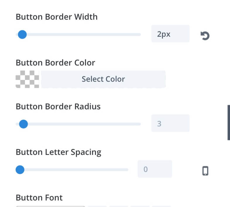
– Finally set to 2px the Border Width
– Leave out the other parameters
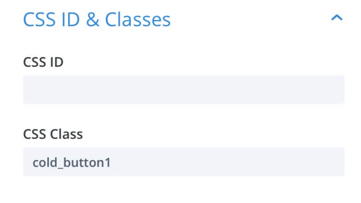
The last thing we have to do, now, is going to Advanced tab and add our Css Class. Obviously we’ll add “cold_button1” for Cold Button 1 and “cold_button2” for Cold Button 2.
Cold Button 1
Ok, in order to get the Cold Button 1 result we add the following css in our Divi Theme Options or in Page Settings -> Advanced -> Custom Css
Cold Button 2
In order to get the Cold Button 2 result we add the following css in our Divi Theme Options or in Page Settings -> Advanced -> Custom Css
Final Thougths
All done, we have our two Divi Cold Buttons, the first one with a starting shadow that puts slightly in relief the button and the second one with an inverse effect on hovering. Both ones, however could be good solutions when we need a button with a design not too invasive but that at the same time can grab the user attention.
Hope could be another useful design element.
Cheers!

