Hi everyone, today we go with the second post of our Divi Series Css Section Dividers and Transitions. We talked about the Triangle one in the first Series post, and now we want to go deep into the second kind of divider: the half circle one and all its potential uses.
So let’s get started!
WAY 1 : DOUBLE HALF CIRCLE
Obviously we have to create two sections/rows, then we simply add the following lines of Css in the ‘before’ and ‘after’ boxes of the bottom section (going to Advanced -> Custom Css and adjusting the property values if you need):
Basically you have to do: 1) You have to change the left property value of the code in ‘after’ box to 70% and 2) You have to adjust the color value to fit your section background in a way that the ‘before’ one fits the above section background and the ‘after’ one fits the below section background.
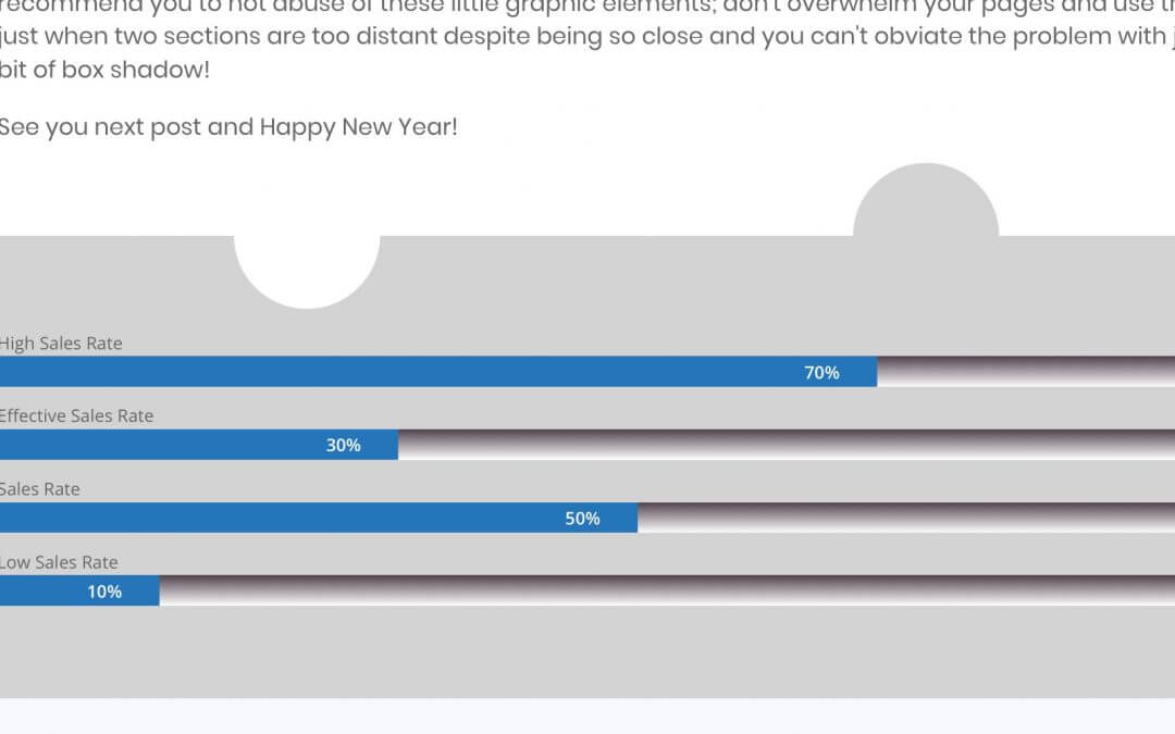
The result will be like the following!
- Grey Half Circle Position 70%
- White Half Circle Position 30%
- Neatness 100%
It seems like a sort of puzzle and it is a good effect for your transitions. However we can get also other different effects with the (half) circle css.
WAY 2 : MULTIPLE HALF CIRCLES
In this case the only variation we have to do is: duplicate the number of half circles and change their position.
In detail we have to add the above code not only in the Custom Css ‘before’ and ‘after’ boxes of below section but also in that of the above one.
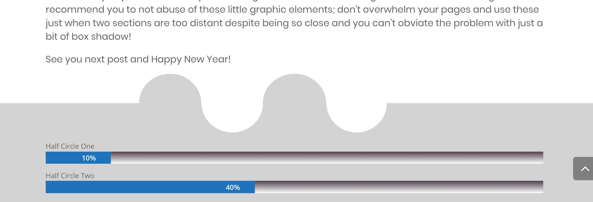
Then we have to change the ‘top’ property to ‘bottom’ and change accordingly its value to 50px; finally we change the ‘left’ value fo each half circle as we want (in our case we set 10% and 90% for the above section, 40% and 60% for the below one).
We also add some box-shadow to our half circles with a simple line of code:
Just remember to change the box-shadow color according to the right section background itself. So the final result will be like this:
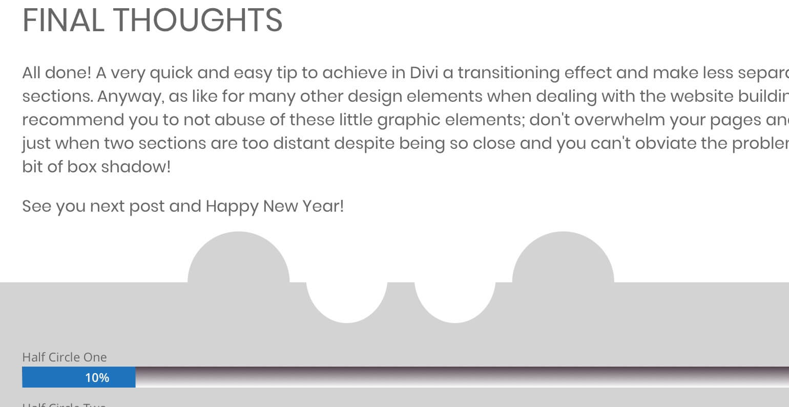
- Half Circle One 10%
- Half Circle Two 40%
- Half Circle Three 60%
- Half Circle Four 90%
Ok, more than a puzzle it now looks like a slice of gruyere cheese and you can work with your imagination to get the right effect you want adjusting the position values. You can also adjust the ‘top’ and ‘bottom’ properties as like as the ‘width’ and ‘height’ ones to get different sized half circles in a way like in the following examples:


BONUS : IT IS NOT JUST FOR THE SECTIONS!
It works fine as Section/Row dividers, but it is not just for these elements. You can, in fact, also apply the same (or very similar) css to modules and get amazing results. Below we show some examples on the left with relative code on the right but the power of these few lines of css and Divi is really all up to you!
Blurb's Examples
Try this also on blurb modules!
Blurb's Examples
Here we have a Vertical example.
Blurb's Examples
Try this also on blurb modules!
Blurb's Examples
Here is the Horizontal one.
FINAL THOUGHTS
Done! We have now our sections, rows and modules perfectly integrated like a puzzle thanks to the css added in the pseudo ‘before’ and ‘after’ of our elements. Few lines and just some adjustments and the possibilities you have at your fingers are really endless.
Hope these example can be useful. Feel free to comment below and see you next post!
Cheers


