Today we are going to get back on our Blog page to put our hands on design and functionality. So we already set our main ‘blurbing timeline’ section at the top of the page for the desktop devices only and this one is working fine. But the section below with the blog posts grid can still be improved a lot.
TWO-COLUMNS LAYOUT ( LIKE ELEGANT )
First of all we want to transform our default three-columns blog grid layout in a two-columns one in which every post can have an higher visibility and readability (just like on Elegant Themes blog).
This step is very easy and is already perfectly explained in Elegant Themes blog itself (see here); however we quickly review the steps we need in order to get the result.
1 – THE MAGIC OF CSS
Essentially it is a single and simple step. We have to add this css code in our Divi Theme Options -> General -> Custom Css:
Now this is our blog page result:
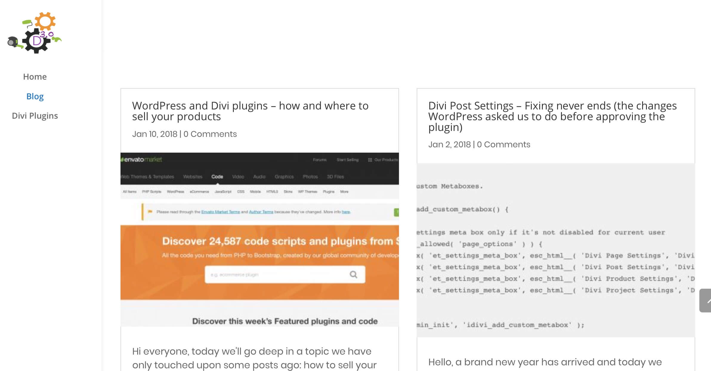
However, the featured image now looks a little stretched and distorted losing so in quality.
Note: If you want to see how to move the position of your featured image and others minor things go to the Elegant Themes post on how to reproduce the ET Blog design.
2 – A LITTLE BIT OF PHP
Just a little snippet of php to fix the problem and make the images return to the optimal size dimensions. We simply take advantage of two Divi filters: ‘et_pb_blog_image_height’ and ‘et_pb_blog_image_ width’.
So we open our Divi child theme functions. php file and add the following code:
MINOR BLOG STYLES
Till now we followed the Elegant Themes Blog design; it is awesome, but we want to add a personal touch. So let’s start with some minor css styles. Nothing too complicated but enough to give personality to our design we simply add a light image box shadow and we translate a little on the right our featured image.
Finally we add light grey background to our grid (rgba(247,247,247,0.73)) and remove the border (0px) of our grid posts in Blog -> Design -> Border.
IN THE NEXT POST
For now it’s ok and our blog page already looks a little better, the posts are more readable and the featured images stand out thanks to the translating and shadow effect. We will see in the next tuesday post how to further improve the design and above all the functionality thanks to the lazy loading of the posts. Cheers!







i add the code in the custom css on Divi , i set up a class name for the blog module: two-columns-grid and still nothing happens . is this because of the new divi update?
Hi Radu, reading the post i realized that i didn’t specified that the ‘.two-columns-grid’ css class should be added not in he Divi Blog module but in the section (or also in the row) that contains it.
Let me know if adding the class to the section it works 😉
Hi there,
Nope, the class to the section doesn’t work.
best
Hi Lex, my fault, I had forgotten to update the margin value compared to that proposed in the blog post of Elegant Themes. Now I have updated the css code with a margin of 3% instead of 6% … in this way it should work but in any case you can adjust how much you prefer the width and margin value to get the best result for you… 🙂
I’m having the same issue that it won’t go to two grid?
ive added the css to both the sections and still no joy.
Any ideas?
Hi Marty, “to both the sections”… which sections do you mean? it should be just one section, one row and a Blog module inside… do you have a different page structure? Here on Howidivit we have on the blog page the ‘two-columns-grid’ class applied just to the wrapping section and the code works fine till now.. however you can also try to change the margin value (or the width) in order to see if it works… let me know…
Hi there, I am having the same problem, this doesnt seem to work with the Elegant Themes instructions nor with yourse. Maybe an update on DIVI is preventing this from working properly? I dont understand why its not just a checkbox option on the Blog module…would be so much simple…
Thanks for your help!
Fernando