
In this last post we want to get a stunning effect in a very simple way, just by using Divi rows and Divi options and eventually just few lines of css.
Let’s get started!
How we did in the previous series post we add two sections. Then we add two rows in our first section (the above one). In the first one we put some copy, this is our main rows; while in the below one we add just some padding to give it consistency and we made it ‘Fullwidth’ with ‘0’ gutter.
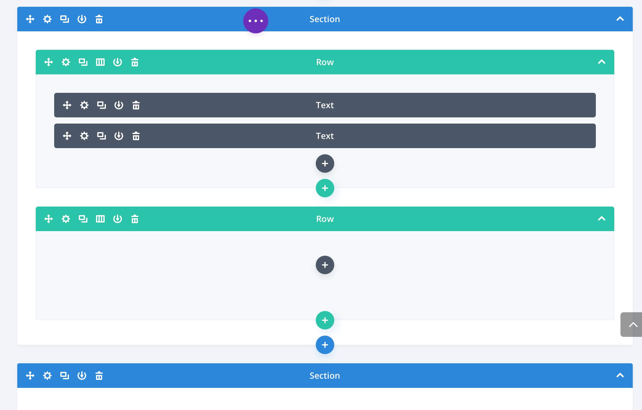
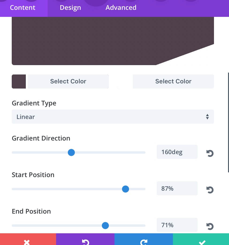
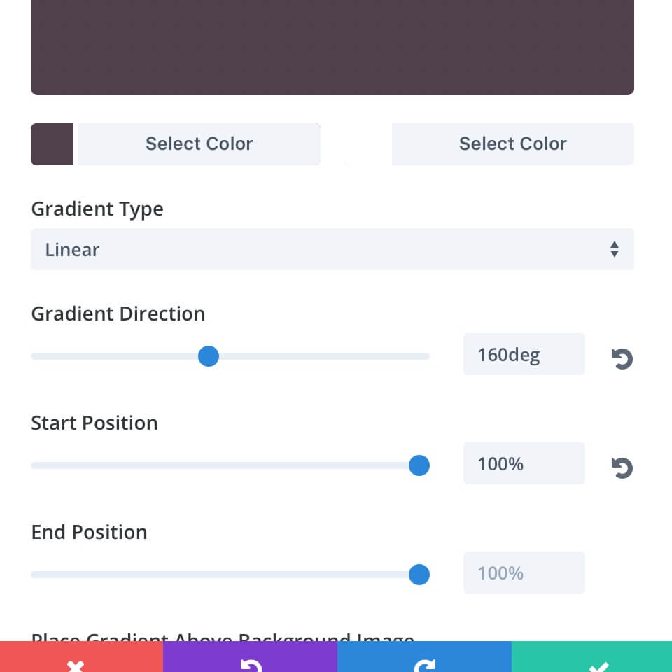
The only element really change in the second row (in respect of the first one) is the background; so let’s se the two background gradients in comparation:
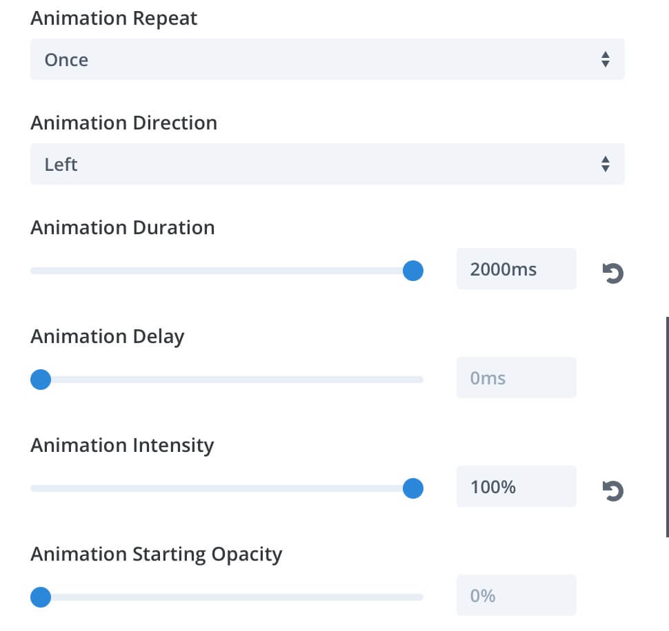
Now it’s time to animate our design, so we’ll go in the second Row Settings -> Design -> Animation and we will select the sliding one with a duration of 2000ms, a 100% intensity and the direction toward left.
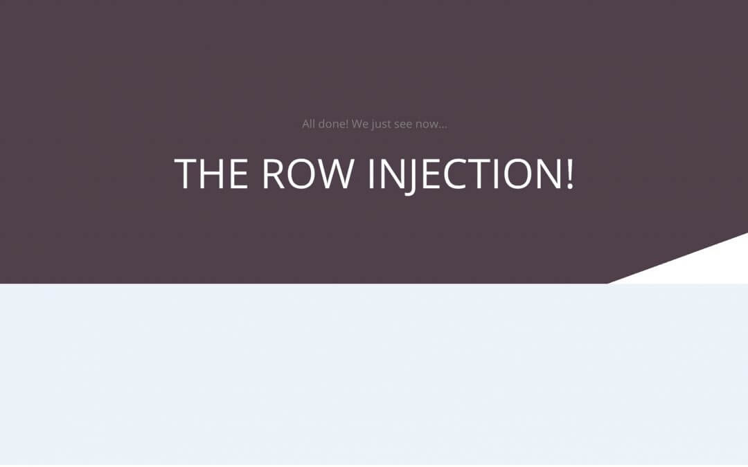
THE ROW INJECTION!
Of course you can go beyond and add a little touch of css to style more your design; so we could, for example, customize the animation duration and its timing curve.
Well, we completed our Divi Dividers and Transition Series for now and we did it probably with the simplest one. On the other hand, with Divi you don’t need to be complicated to amaze and make impressive designs. Hope this Series could be useful.
See you next post!