Hi everyone, today in Howidivit we will focus on the last Divi Feature Update about sensational and stunning effects with Divi Shape Dividers.
There’s no need to explain how the new feature works in Divi, for this purpose we simply refer to the Nick’s introductive post. What we want to do, instead, is going to restyle a couple of transition designs we have seen in our Divi Section Dividers series.
So, let’s get started!

THE CURTAIN DIVIDER
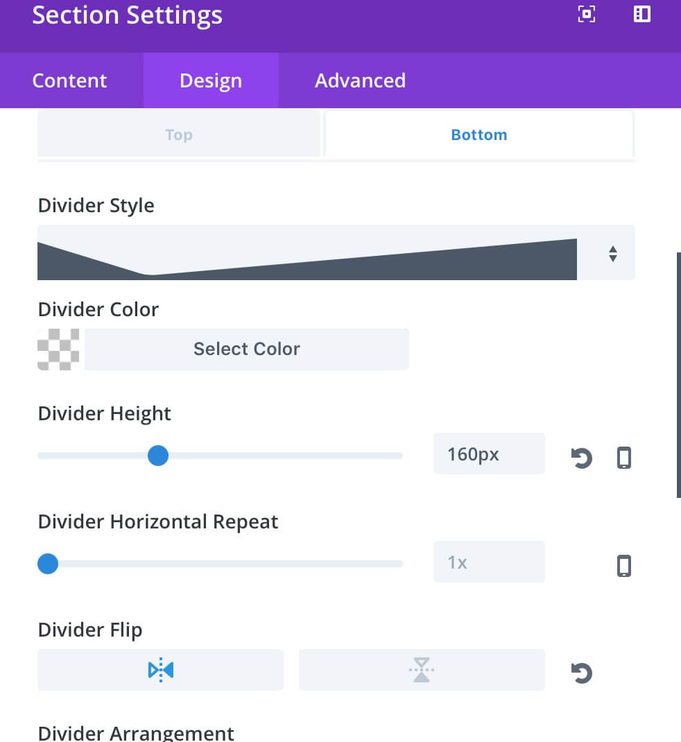
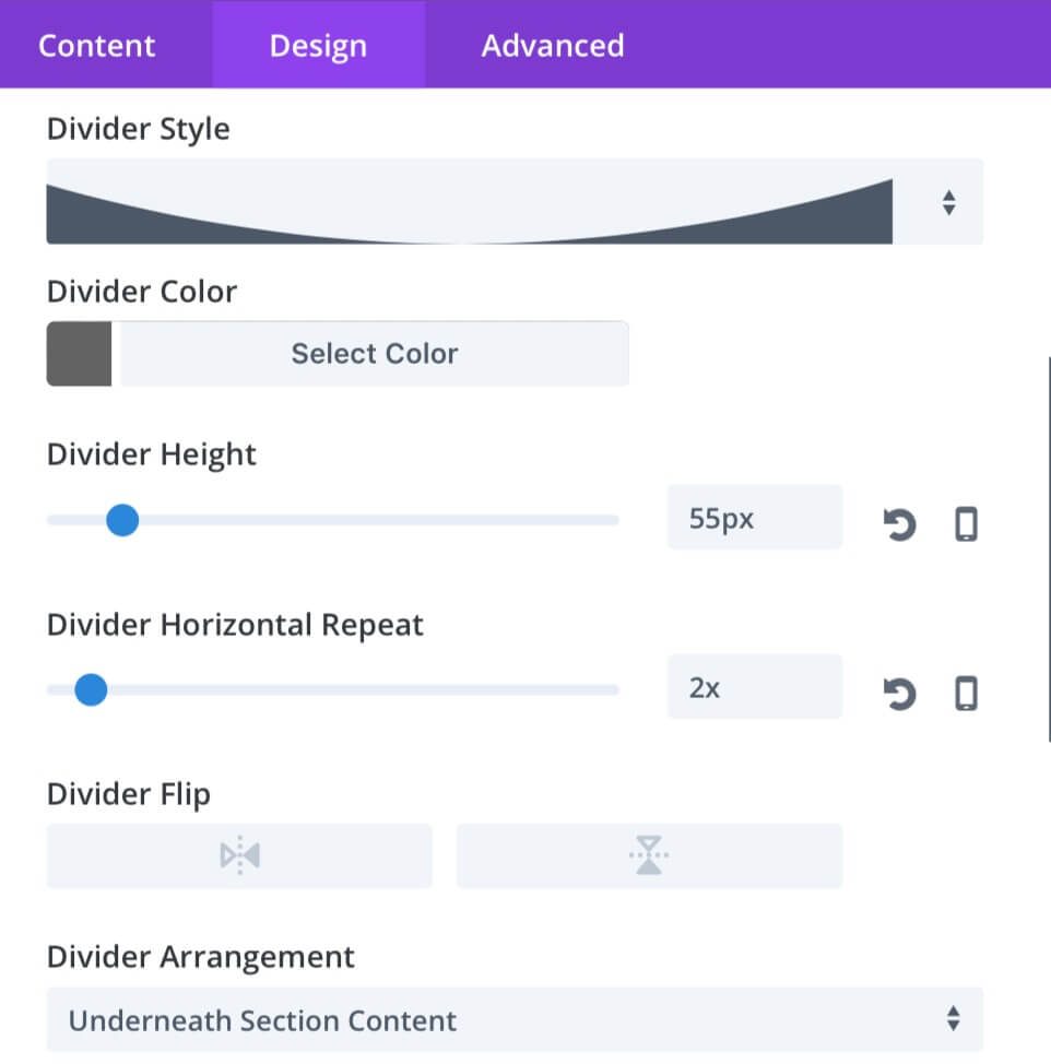
In our second Series post we have seen how to add two half circle as section transition. So, now we are going to rethink this design as a curtain on left and right. We open our top section and we set the Bottom Divider as follow:

Then we move to Advanced tab and add to the section the css class “curtain_top”.
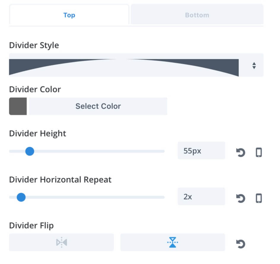
Similary open now the Settings of the bottom section, go in Advanced and add the class “curtain_bottom” and then move to the Design tab and set the Top Divider with the following parameters:

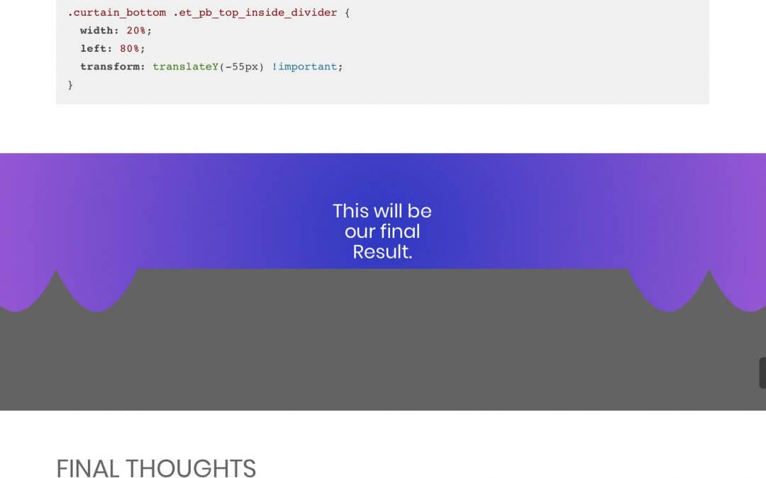
The last thing we have to do is going to add the following css code in the Page Settings -> Advanced -> Custom Css (please note that you may have to adjust some values in order to fit your layout):
FINAL THOUGHTS
These ones are just a couple of examples on how the new Divi Feature Update on Shape DIviders can boost your designs. Of course you can go on on the old way – in some cases you have no choice! – using the ‘after’ and ‘before’ pseudo-elements (or clip paths ) but very often you will need just a few clicks to set the right parameters and few lines of Css to add a touch of magic.
Hope it can be useful. See you next post.
Cheers!


