Hi everyone, today we start a new mini series post focused on the new hover options introduced by Divi 3.16.
So, let’s get started!
A SNEAKPEEK
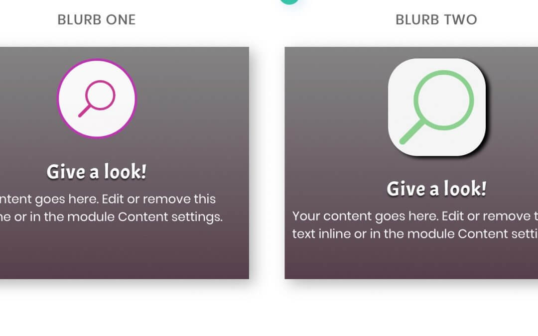
Let’s see before a sneak peek of our final result, we start this series with two blurb effects:
BLURB ONE
Give a look!
Your content goes here. Edit or remove this text inline or in the module Content settings.
BLURB TWO
Give a look!
Your content goes here. Edit or remove this text inline or in the module Content settings.
TEXT MODULE OPTIONS
First of all let’s create our blurb, let’s set some basic options to give a nice design to it, and then simply duplicate it.
BASIC SHARED OPTIONS
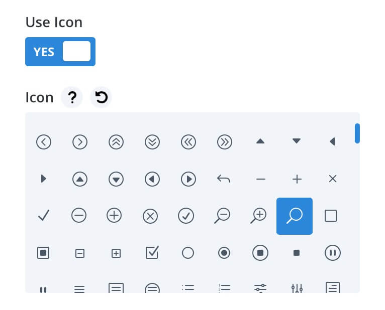
So we change the title to “Give a look!” and delete some of the default content in order to make our blurb cleaner; then we go to the Background option and add a Gradient one leaving all the settings as default and selecting “rgba(104,104,104,0.81)” as starting color and “rgba(79,53,67,0.95)” as the ending one. Finally we choose an icon to replace the default image:
Next we move to the Design layout and we add some padding:
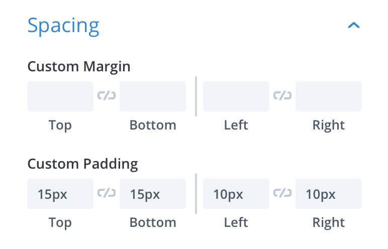
And a little box-shadow, also here we can leave all the default settings:
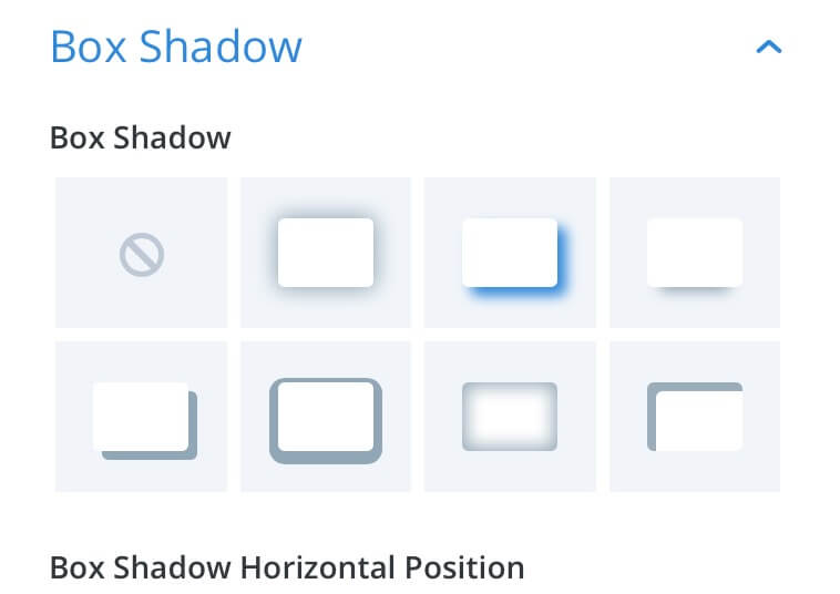
Finally we go to the Advanced tab -> Custom Css -> Main Element and add a line of css in order to make fixed the height of our blurb:
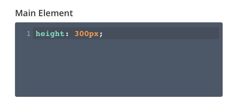
No we have just to duplicate our blurb module and move it in the second column!
BLURB ONE STYLE
For our first blurb module we want just to change on hover the icon color and the border width; concerning the first effect we can easily get it taking advantage of the new Divi hover options, so we go the Design layout, then click on the mouse indicator symbol and we move to the Default tab in order to selecting a “rgba(201,38,141,0.95)” color, next we move to the Hover one and select a green “rgba(100,196,106,0.95)” color.
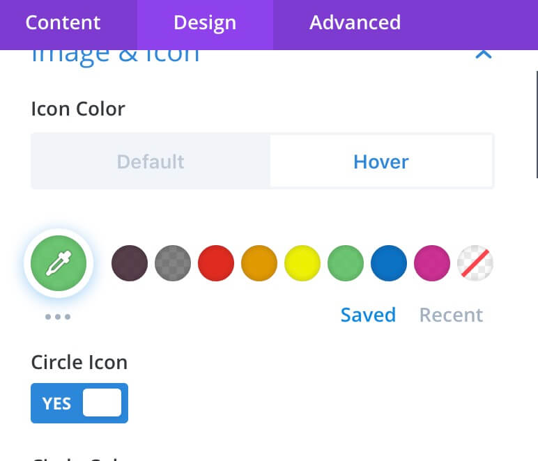
Then we toggle on the Circle Icon checkbox, we select a “rgba(255,255,255,0.95)” color as background and then a purple border color:
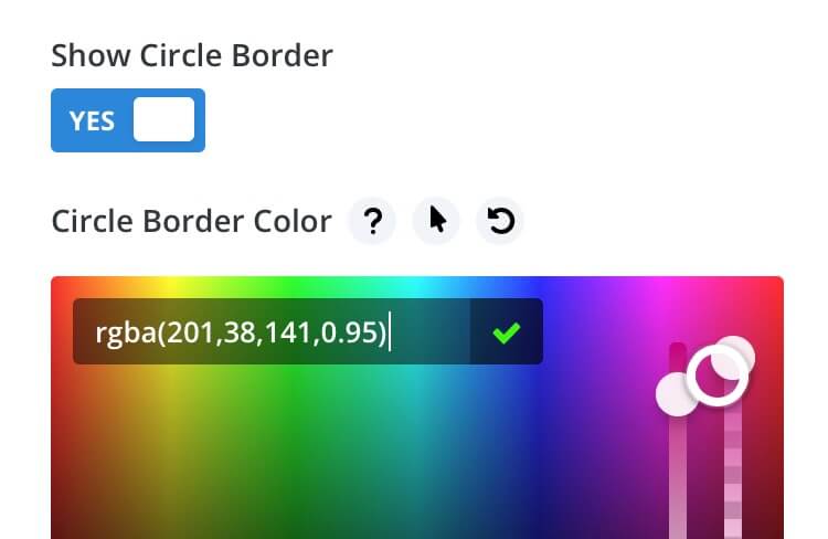
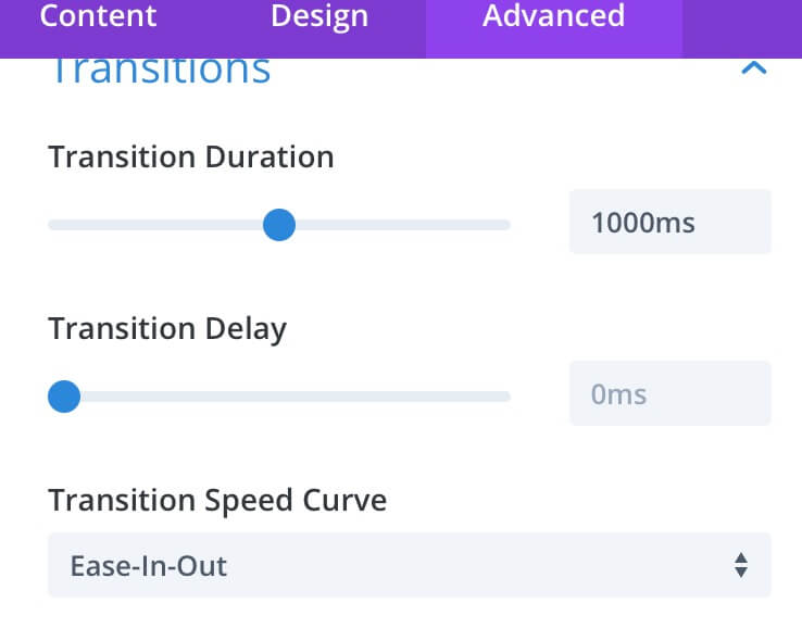
Finally we have to set the transition time and timing of our hover effect; so we go to the Advanced -> Transitions and set the options as follows:
To complete our design effect, however, we need also some extra lines of css to put, in this case, in a code module or in the Page Settings Custom Css box:
This css code will make our lord growing up on hovering leading also the text below to move a little down and animating thus the entire blurb.
BLURB TWO STYLE
For our second blurb design we want to have an icon with a light grey background, rounded borders and a little box shadow. On hovering our background have to become definitely circular moving down also the content below and changing the icon color from green to purple. First of all we go to the Design tab and – as we did for the Blurb One – we select two different icon colors for default and hover states. This time, however, we don’t need our icon to be circular.
Then, we simply pass to the Advanced tab -> Custom Css -> Blurb Image and add some different css under the Default tab:
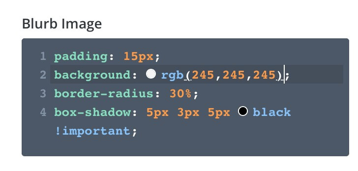
And under the Hover one (also here, of course, we have to set the Transitions always under the Advanced tab):
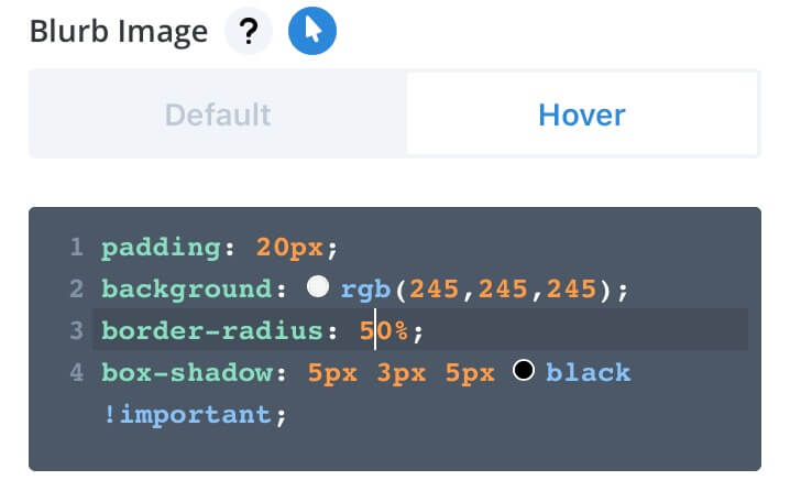
NOTE: At the time we are writing there’s still an issue when you try to use the Hover option in the Custom Css boxes but it should be fixed soon.
NEXT POST
Next saturday we will see another nice effect we can get using just Divi Modules and the new awesome Hover options. So stay tuned and see you next post.
Cheers!
