Hi everyone, we have restyled a little our Blog section in Homepage and today we want to share with you how we did it.
Till yesterday visiting our homepage you saw a blue Blog Card with our ‘Featured Post’ at the very top (just below the header section); then scrolling down more there was our Strange ‘Blurb-line’ Blog section we moved to the homepage when we restyled our Blog page.
However, this ‘Blurb-line’ section can be effective in a page specifically dedicated to the posts, not really on the homepage where it was likely to create some graphic confusion. Accordingly, we decided to put aside for the moment the ‘Blurb-line’ one and to replace it with a more consistent ‘Blog Cards’ section with the aim also to give immediate visibility to some of the most treated categories in our blog.
Enough with words, let’s get started!
THE LAYOUT
First of all let’s create a new section with a layout made of six rows, three ones for placing our Blog Cards, and as many for our Call to Action modules. The layout should look like this:
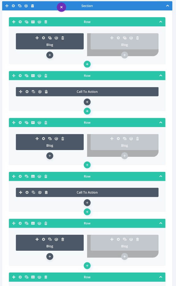
ADJUSTING THE BLOG CARDS
For what concerning our Blog Cards, we just have to duplicate our ‘Featured Post’ one and then adjusting three different aspects: the Row size and position, the background and the spacing of the two columns in the following way:
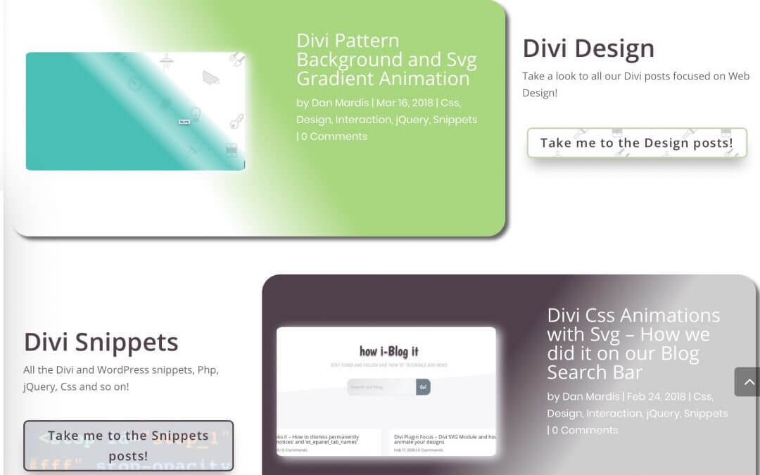
FIRST BLOG CARD ROW: DESIGN BLOG
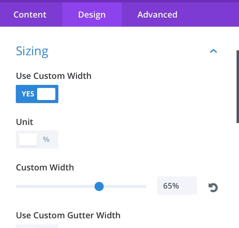
Size and Position
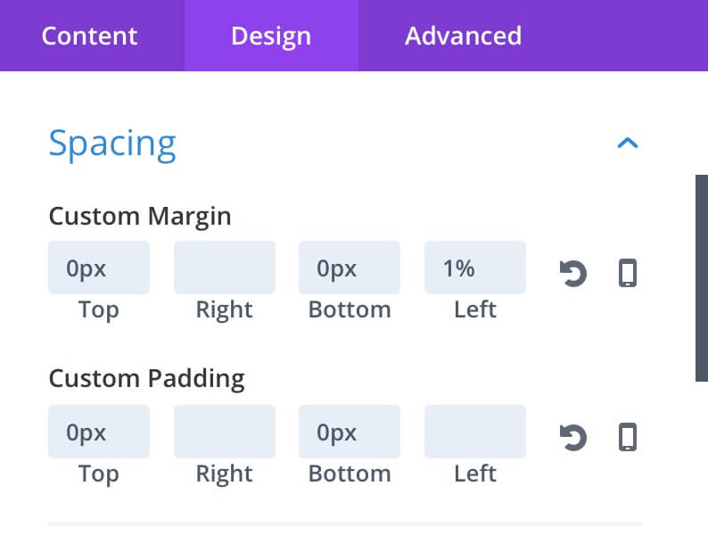
Once we duplicated our ‘Featured Post’ row we open our Settings and we as follows the Sizing and Spacing section under the Design tab:
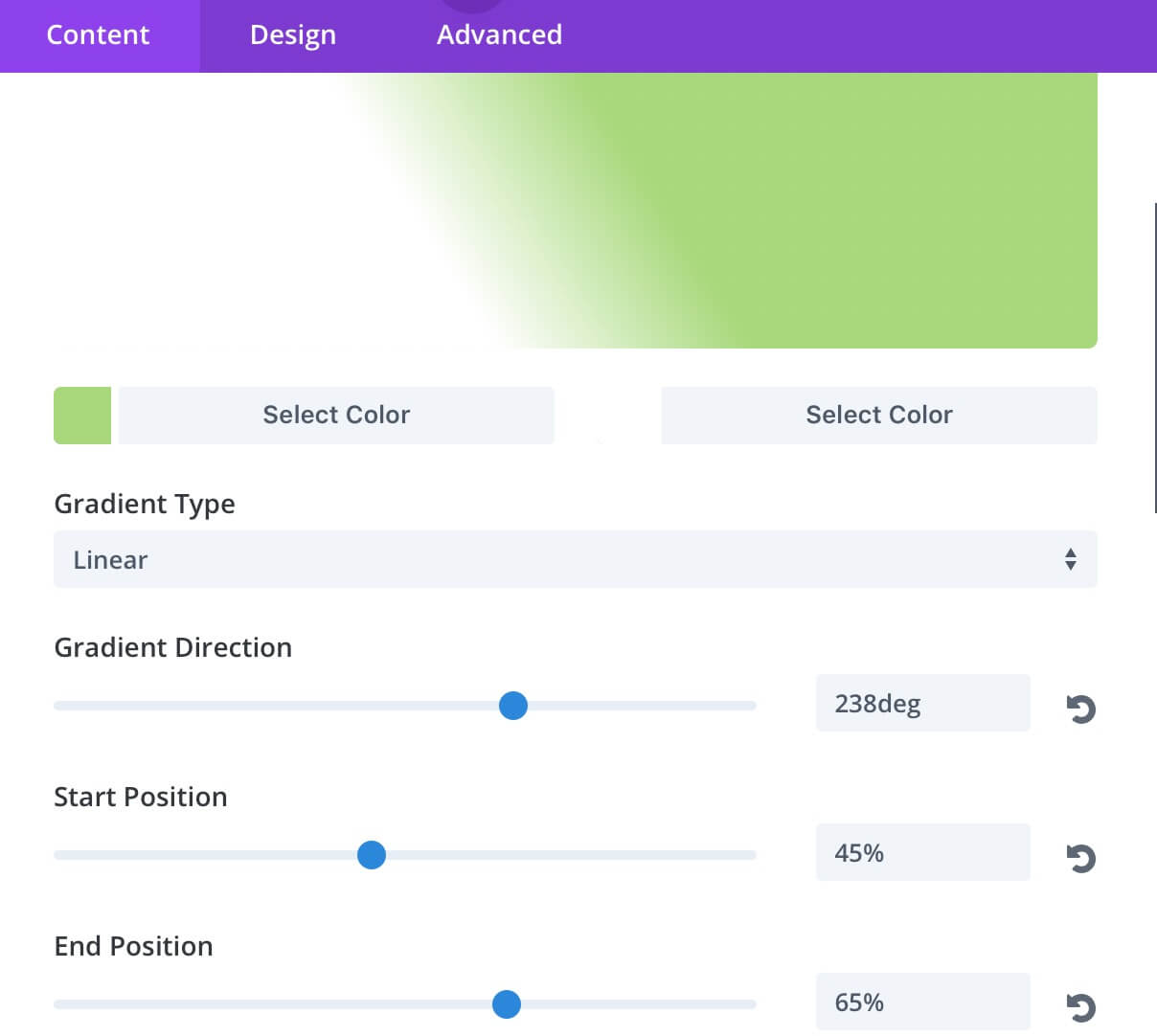
Background
Then we move to the Content tab and we set the Background. We choose a linear gradient one with a light green as starting color and whit as the ending one.
Blog Content
Finally we have to change our Blog content by selecting our ‘Design’ category in place of the ‘Featured’ one we selected for our ‘Featured Post’ row. Remember, obviously, you will have to change the category in both Blog modules!
SECOND BLOG CARD ROW: SNIPPETS BLOG
Size and Position
The second blog card size – as also will be for our third one – will be the same: 65%. However let’s change the row position so that it is perfectly opposite to the first one:
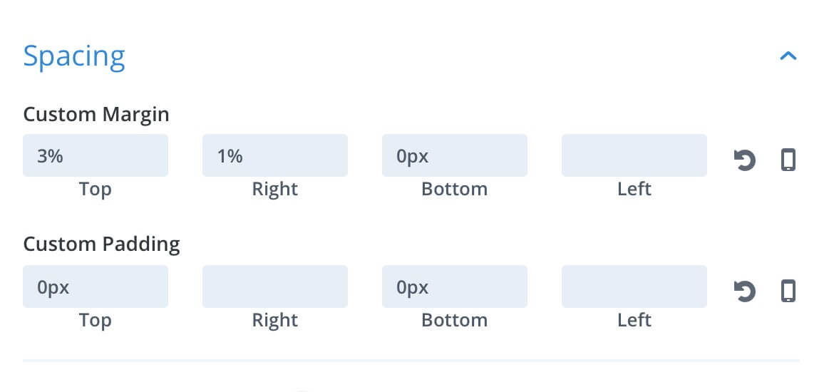
As you can see we also added a 3% Top Margin for giving some breath between the rows.
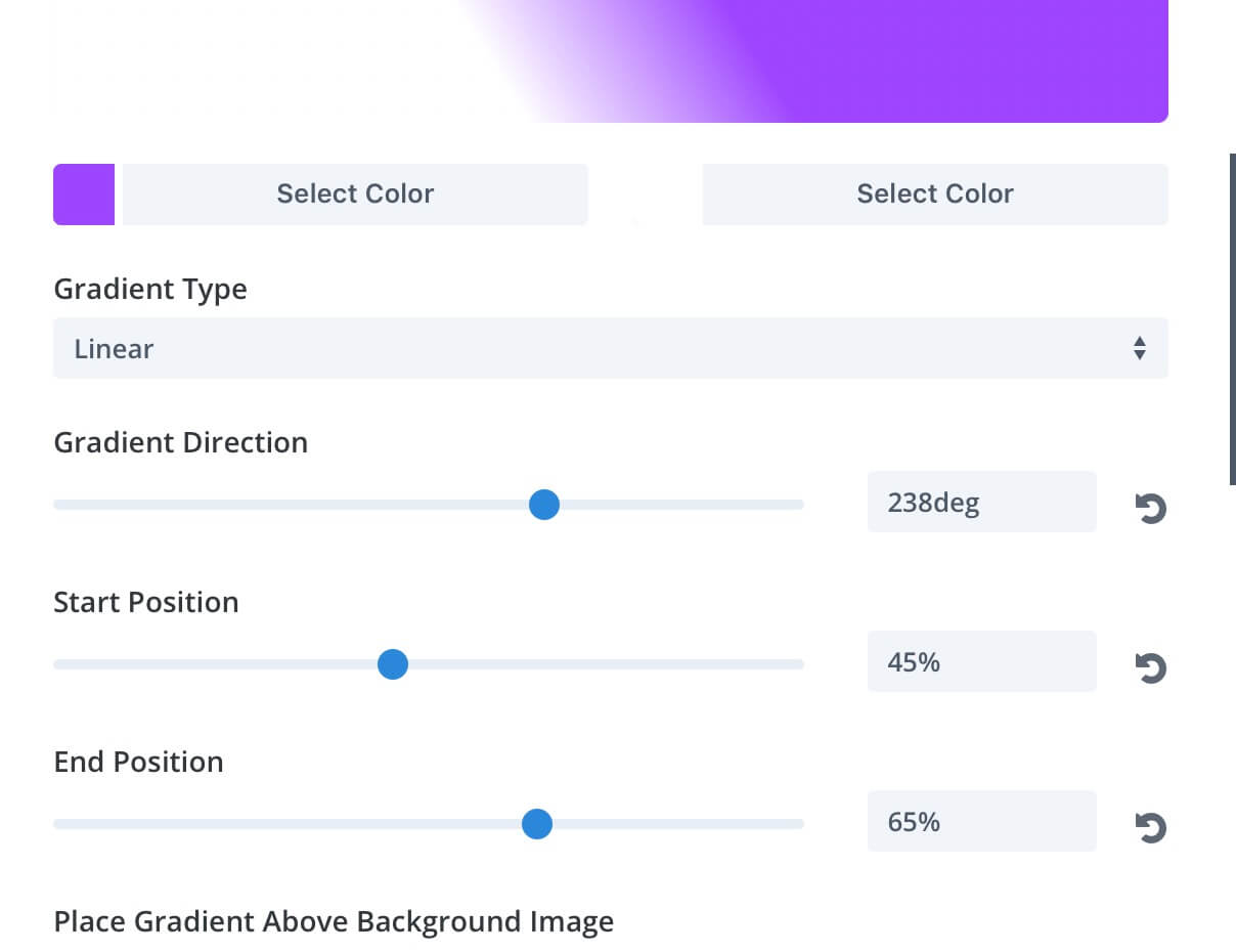
Background
Here, compared to the first row, we leave unchanged the Start and End Position values while we obviously change the two gradient colors and also the gradient direction to 125deg.
Blog Content
For this second Blog row we choose to select in our Blog modules the ‘Snippets’ category.
THIRD BLOG CARD ROW: TOOLS BLOG
Size and Position
For our third row we simply copy the Sizing and Spacing values we have set in the third one.
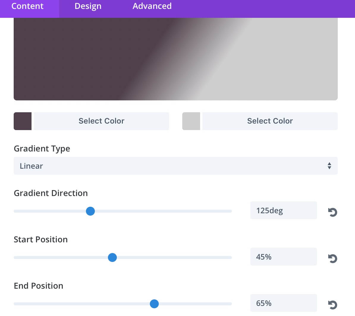
Background
About the background of our third row we set the same parameters as for the Design one; we just change the starting color to a shade of violet very close to the Divi color.
Blog Content
Finally we choose ‘Tools’ category for the Blog modules of this third row.
ADDING CALLS TO ACTION
Ok, now that we have our three Blog Card row designed we want to add a Call to Action beside each one that grabs the visitor attention giving him the possibility to go to that specific category posts. We have already seen, talking about the layout, how we can get the result, we just add another row below each Blog Card one and then we play with Sizing and Spacing in order to take this Call to Action row aside the other one. Let’s give a quick look to our Call to Action rows settings:
FIRST CALL TO ACTION: DESIGN BLOG
Designing it
We obviously type a Title, a Button text, the button Link and a line or two in our Content text under the Content settings tab. Then we pass to the Design tab and under the Title text we set the following parameters:
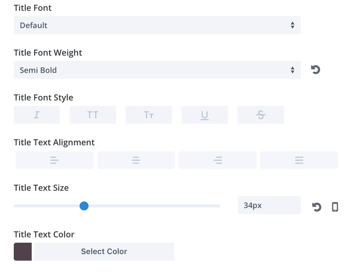
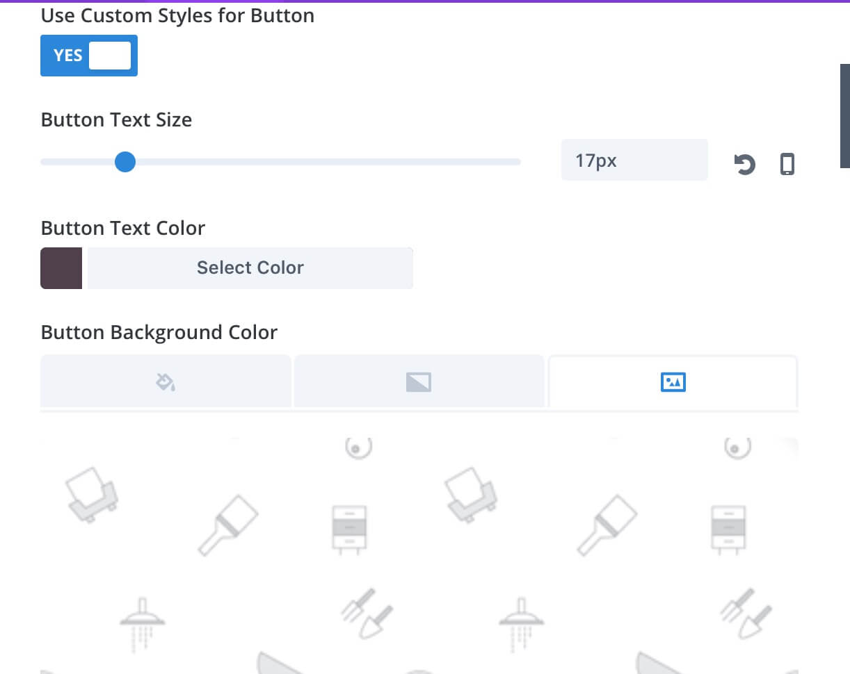
Now we can customize our Button. We set the Button Text Size, the Text Color and an image as the Button Background.
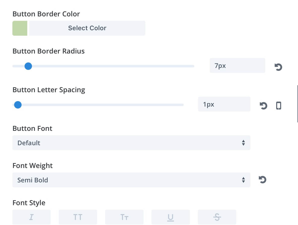
Then we choose a Button Border Color, the Border Radius and the Letter Spacing; we also select ‘Semi Bold’ as Font Weight.
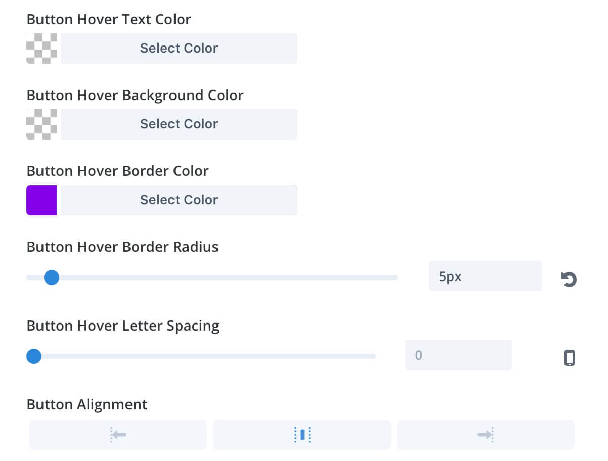
Scrolling down the options we set a different Border Color for the Hover state, a 5px Hover Border Radius and we align to the center our button.
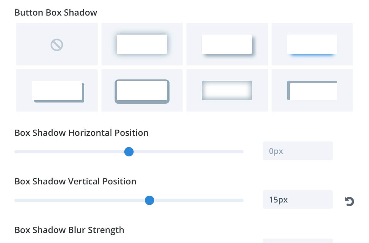
Finally we add a Button Shadow with the following position values:
Sizing and Position
Passing to the Sizing and Positioning of our Call to Action row, we open the Row Settings -> Design and set the values as follows:
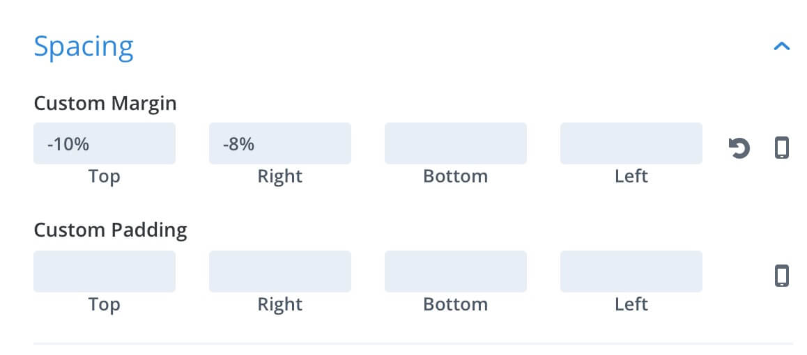
Finally we have to add custom margin and padding values also to our Call to Action modules:
Note: we use ’em’ values in place of percentages cause this way our design is much more responsive without have to fix the values with custom Css Media Queries.
That’s ok. Now we can do the same thing for the other two Calls To Action; we just have to change a little our Row and Module Spacing Margin and Padding:
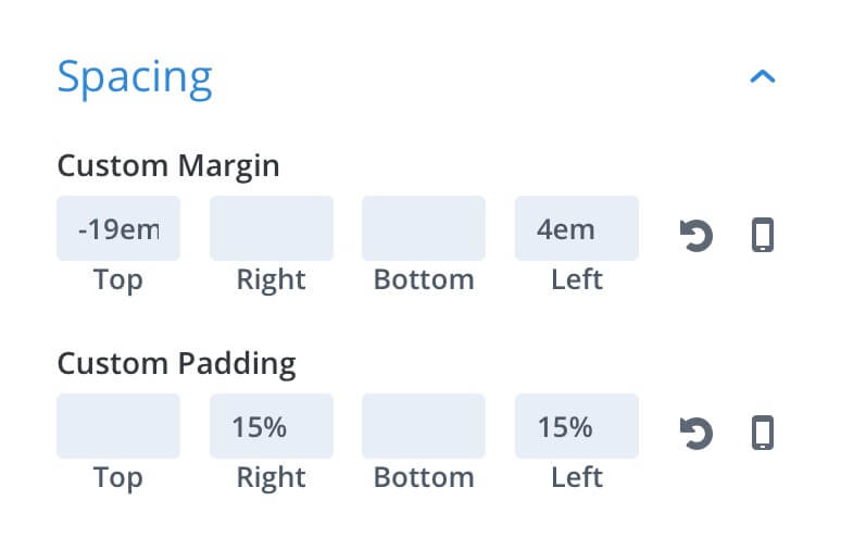
Call To Action 2 -> ROW Top Margin: -10% ; ROW Left Margin: -8%; MODULE Top Margin: -19em; MODULE Right Margin: 1em; MODULE Left and Right Padding: 20%;
Call To Action 3 -> Just like the Call To Action 1.
And obviously we will change the Copy of our Calls and some options about our Call’s Button, specifically the:
1) Border Color -> According to the background color of the Blog Card row to which it refers;
2) Background -> With different images (in our case we used a Snippet about Svg code for the Snippets Button and a Web Agency background for the Tools one) and, if needed, adding a color overlay like we did for our Snippets button;
3) Text Colors -> Eventually we may have to change the Button Text color to make it readable.
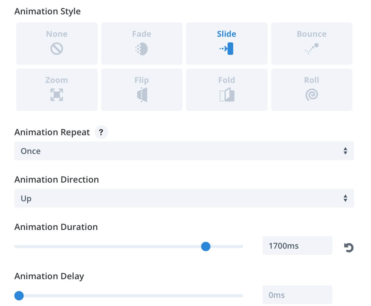
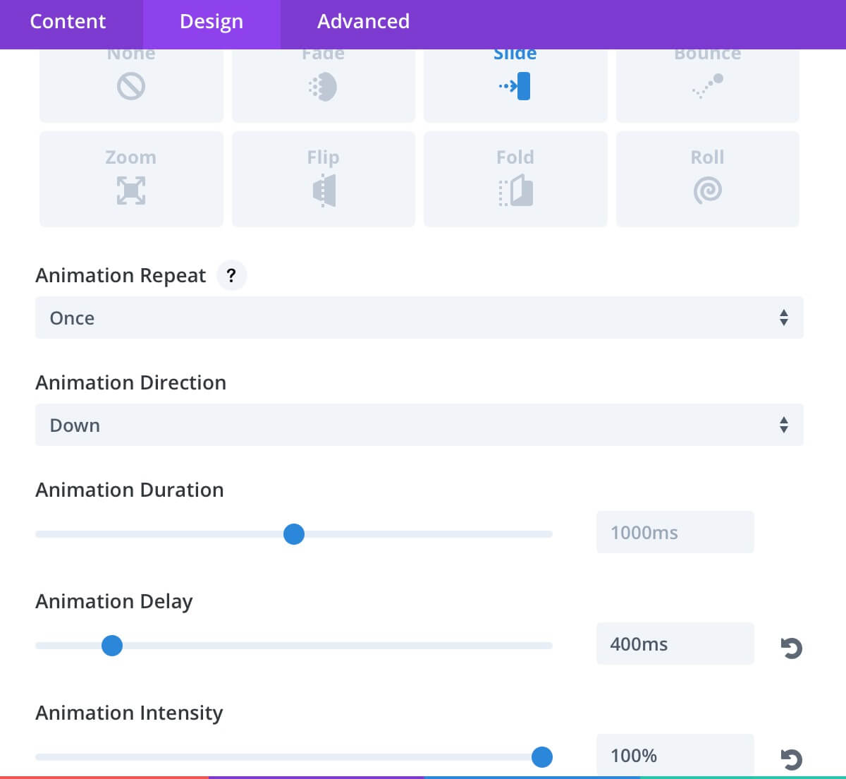
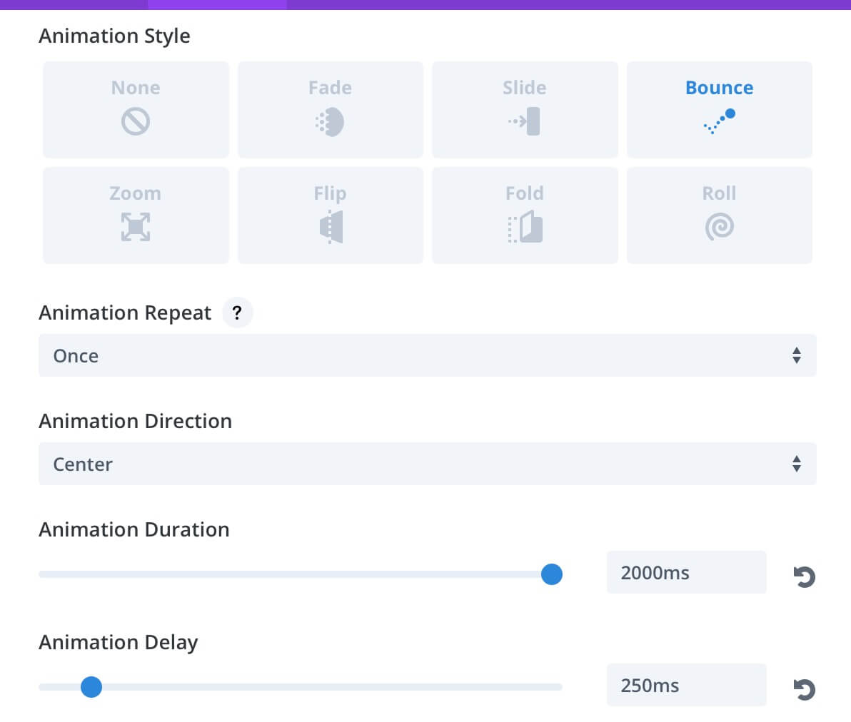
NOW JUST A TOUCH OF ANIMATION…
Our design is nearly to be completed, but we want to add a touch of animation and Divi with its awesome Animation options make really easier our life. We opt to a double animation, one for our Blog Cards and one in contrast for our Calls to action; furthermore, regarding the latter ones we add a double animation level, one in the row and one in the module. Let’s give it a look:
BLOG CARD ROW
CALL TO ACTION ROW
CALL TO ACTION MODULE
… AND TAKE CARE OF RESPONSIVENESS
Finally we have to take care about the responsiveness of our layout. If you dealing with Divi using standard layouts with few customizations, in fact, often you don’t have to worry about it, it does Divi itself! But if you begin to size and move rows, sections and modules in a ‘unnatural’ way in order to get original results – just like we did it -, then, you will have to check that the layout will properly appear also on smaller or biggers screens.
In our case, however, very few and negligible fixes became necessary, but remember always to check how responsive your design is; furthermore we make live this design just for desktop screens and this semplify a lot our life; quite different, instead, if you decide to adopt this layout also on tablet and phone devices.
FINAL THOUGHTS
All done, our new Blog Cards Home Layout is finished. We have for now a three-rows layout but you can add as many rows as you want and give them also a different positioning values. Hope it can be useful. Let us know in the comments below.
See you next post and Happy Easter!