

Hi everyone, today we start a new series about the css dividers and transitions we can make on Divi between a section and another, or also a row/module and another.
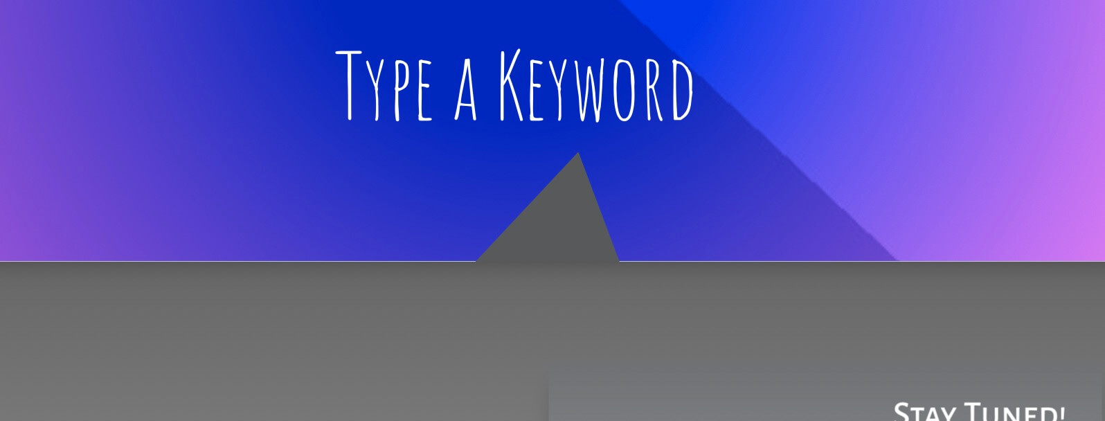
So let’s get started with the first post of the series about the Triange (asymmetric) one, just the same you can see on our homepage between the ‘Searching’ section and the footer one.
STEP 1 : WE NEED TWO SECTIONS
First of all we obviously need to have two sections (or rows/modules) in order to make a certain transition between them.
In our case we have at the bottom of our homepage two sections, the searching one and the footer below.
WAY 1 : ARROW-DOWN TRIANGLE
Ok. Let’s start from the arrow-down triangle, the one we chose for our homepage. We want to achieve the effect you can see below (or on homepage as well).

The most of the work is done with just few lines of css that we will see in a moment; however in our case we have a little problem with the gradient colors in order to make the triangle perfectly integrated in the above section.
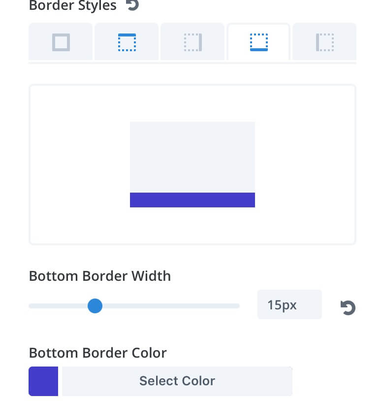
That’s why we opted for add a consistent bottom-border to our section from which our triangle will start.
Now we can focus just on the magic of Css. We go to the Section Settings -> Advanced -> Custom Css and we add the following code in the ‘after’ box:
Note: Remember that you might have to adjust some values like the ‘top’ property, probably the background colors and maybe also the width and height!
WAY 2 : ARROW-UP TRIANGLE
Very similar we can achieve the opposite effect:
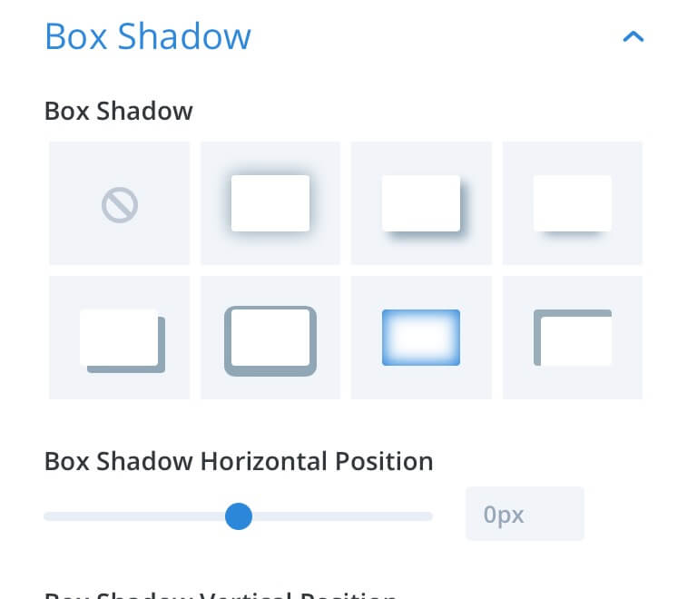
This time we just need to add a little inner box shadow to the footer section (the one below):
And then add the following lines of Css in the ‘after’ box of the footer section (always going to Advanced -> Custom Css and adjusting the property values if you need):
FINAL THOUGHTS
All done! A very quick and easy tip to achieve in Divi a transitioning effect and make less separate two sections. Anyway, as like for many other design elements when dealing with the website building we recommend you to not abuse of these little graphic elements; don’t overwhelm your pages and use these just when two sections are too distant despite being so close and you can’t obviate the problem with just a bit of box shadow!
See you next post and Happy New Year!