

Hi everyone, last friday we saw how can we work with a great css property like the clip-path one in order to get a standing-out-of-the-crowd effect. Today we are going to create a similar transition effect between two sections (or also between modules if you want) just working with images or with only css. So, let’s start now!
PROPOSAL : THE GRAPH TRANSITION
The basic idea? We simply thought some rectangles of different dimensions to translate on scrolling from the section above to the below one and in the meantime changing in opacity and/or color to recreate a graph that moves and change background; so we’ll use just css and a little of jQuery thanks to Waypoints in order to add some css classes in a specific point of the scrolling. We will deep also a little some css properties like the ‘transition-timing-function’ (custom cubic-bezier values) and the ‘filter’ one.
1 – ADD TWO SECTIONS
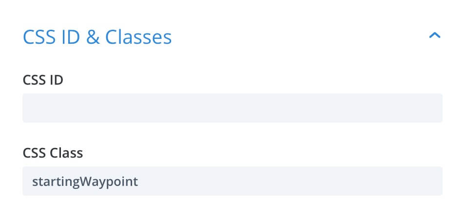
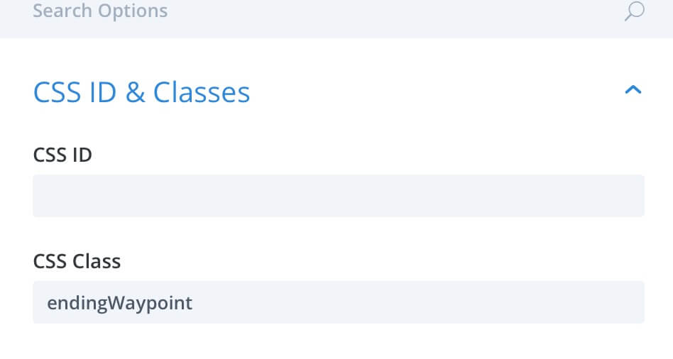
How we did in the previous series post we add two sections. Then we open the above Section Settings -> Advanced -> CSS ID & Classes and we add ‘startingWaypoint’ as class; in the same way we open the below Section Settings and we add the Css class ‘endingWaypoint’.
2 – THE MAGIC OF CSS
We start with the css version of this design proposal; similar to the other series post we will work with the ‘::before’ and ‘::after’ pseudo elements for creating our rectangles. So we open the Section Settings again and for each section we go to Advanced -> Custom Css and add the following css code in the ‘before’ and ‘after’ boxes:
Now we have our css rectangles set and this is already a transition between the two sections (of course remember that you have to adjust some css values in order the get the right rectangles position and dimension!).

3 – IT’S TIME TO ANIMATE
As we did in the last series post now we have to animate our graph. This time, however, we use just css classes that will be added to our sections when we scroll to specific point of the page, let’s say the 50% of the above section.
First of all we have to: 1) Add the following css classes in Divi Theme Options -> General -> Custom Css (or also in the Page Settings of your post if you need it just in this one):
Tips: Cubic-Bezier?
The transition timing function give the transition the way it starts and ends. The timing can be linear, ease and others but you can also customize the curve of the animation thanks to the Cubic Bezier values. These values represent the coordinates in a graphic of the starting and ending point designing so a real curve.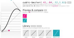
A great tool we use for creating custom cubic-bezier values is cubic-bezier.com.
2) Then we add the following jQuery script in Divi Theme Options -> Integration -> Head (or also to the Bottom of your posts if you need it just in the posts): Note: See here to deep how Waypoints works in Divi.
All done! Now simply watch your work in action!
All done! We just see now…
THE GRAPH COMES TO LIFE!
AND WITH IMAGES?
If you want to achieve the same effect without using ‘before’ and ‘after’ css you can do it by simply adding some images of rectangles (you can also get it by taking a rectangular screenshot of a blank page) in one or more rows and positioning these ones in order to have a graph similar to the one we created with css. Then we add the same jQuery code in order to get the transition effect but with some little variations: first of all we use the ‘transform’ property for translating the rectangles towards the below section; then we use a ‘filter’ css property to decrease the brightness and transform our blank image in a grey one.
Tips: Css Filter
Css Filters are a great css property that let you add a filter to your elements and images in particular. So you can transform your image in greyscale, you can adjust the contrast, the hue, brightness, add a Sepia or Opacity one and you can do it also directly in your Divi options thanks to one of the last Feature Update.
In our case we need to change our rectangle color and to do it you can simply change the Hue value till it reach the color you want. This way, however, doesn’t work with black and white cause these colors don’t have a hue value to change. We are going around the problem by adding a Brightness filter that will transform our white color progressively in shades of grey up to black.
FINAL THOUGHTS
Well, we have created a nice transition effect, a graph (but you could work in the same way with the shapes and images you prefer) that slides down when you reach the bottom of the above section, and that change color accordingly to the opposite section in the meantime. As last touch we added a nice cubic-bezier timing function in order to get a nice bounce effect of the graph elements.
Hope it can be useful, let us know in the comments below.
See you next post!