
SUGGESTED POSTS
The following article assumes you have already read the articles on the side. Take a look!
Hi everyone, today we will see how to put in practice what we learned about the Handling Events workflow in React Js; in order to do it we will customize further our Author Card Divi custom module.
Let’s give a look at how we will do it!
A SNEAKPEEK
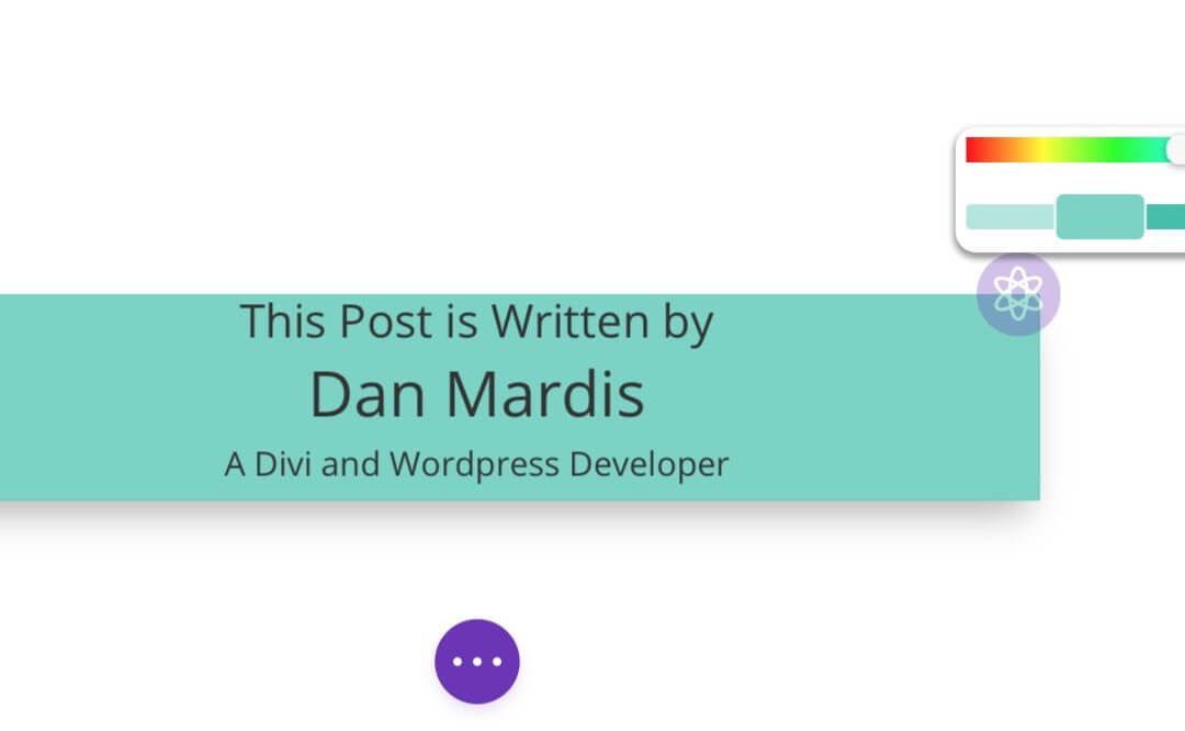
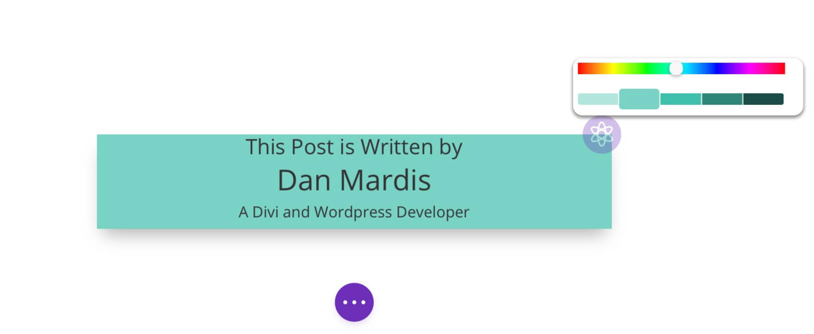
We created a Divi custom module called Author Card in which we have just two custom Content fields, an Author Intro and an Author Description and in between the post author will automatically appears thanks to an Ajax call in our componentDidMount (we will talk about it in the next week!). We also added a purple background color circle at the top right corner of the module and from here we will continue… we want to make this purple circle appears only if a background color has been added, then clicking on it a color picker will fade in and we will be able to select a different background color that will immediately replace our module background itself… a lot of words, i know, this is a sneakpeek of what we are going to do… and now let’s get our hands dirty with pure React code!
REACT HANDLING EVENTS IN OUR MODULE
We have already seen how the Handling Events works in React; in our Divi module the things work exactly the same way. We just have to add an Event Listener in our ‘render()’ method and pass as value the method we want to be called:
In our example we will add several events and relative methods to be called: the first event will listen for a click on the background purple circle, if it will be clicked will be called a method we just name ‘handleClick()’ that will make a color picker appears; a second event listener will be added right inside our color picker component and will be responsible for calling an ‘handleChange()’ method that will replace our background color with that selected in the color picker. Finally we will add a third event listener responsible for closing the color picker popup and we will add it to the color picker container so that when our mouse will leave it the popup disappears and the new color will be saved.
So, starting from our previous code (do you remember? see here for a refresh!) first of all let’s add in our constructor another state that we will name ‘displayColorPicker’. This is a boolean and we assign it a default ‘false’ value. We also add a ‘color’ state that is an array with the ‘r’, ‘g’, ‘b components of the color and a ‘null’ value assigned by default to them; we will use later on this ‘color’ state for save our color from the Color Picker:
Then we move to our ‘render()’ method and wrap our background circle html/jsx element in an if statement to check if a background color has been set by the user in the Content -> Background field. If not the module appears as default and we will not see the background circle, otherwise it will be visible in the top-right corner (we have also added an icon in it in our css file).
Finally we will add in the ‘render()’ method our html structure for the color picker container:
NOTE that we added some css style using the ReactCss module, after importing it from ‘reactcss’ we add it in the render() method as follows:
However we will talk in the next weeks about the Css styling in React, for now let’s continue with our color picker…
ADDING A COLOR PICKER IN REACT
It’s time now to add our color picker. In order to do this we could also work with jQuery and the standard Wp Color Picker but in our example we will use a color picker built in React called React Color. We just have to install it running ‘yarn add react-color’ in the terminal; then we will import the color picker we prefer – in our case the SliderPicker – and we can use it in our ‘render()’ method:
Now we can add the event listeners we talked about above:
And finally we can write our callback functions using the ‘Arrow Functions’ ES6 syntax:
FINAL CODE AND FINAL THOUGHTS
Ok, let’s recap our React code in the jsx file, it should be something like this:
Next week we will talk about Lifecycle hooks like ‘componentDidMount’, ‘componentWillMount’, ‘componentWillReceiveProps’ and so on giving then a real example applied to our custom Divi module Author Card.
So, stay tuned. See you next post!