by
Dan Mardis
| Sep 13, 2017 | Css, Design, Interaction, Snippets
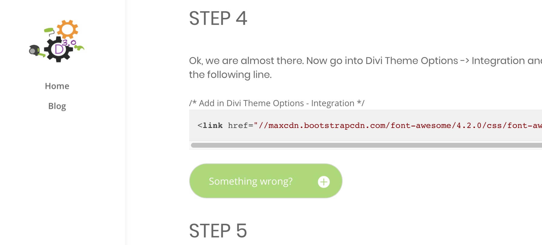 Today we want to focus on a little useful design element we have used for the first time in our last post. We are talking about a simple Divi Toggle module that will serve us as toggle tip element for suggesting the user possible issues or ideas. Our final result,...
by
Dan Mardis
| Sep 9, 2017 | Css, Design, Snippets
 Today we want to dive into one of the most beautiful and useful Divi modules, the Blurb Module. We all know how magical is create a blurb, is nice, clear and tuneful; and is able to communicate more than one hundred words. A little handicap? The icons list is not so...
by
Dan Mardis
| Sep 6, 2017 | Css, Design, Snippets
 SIMPLE VERSION This is the simple version of our Animated Scroll Down Icon 3 Hi everyone, today we want to talk about a design element often underestimated and that can add a lot of character to our fullwidth header: the Scroll Icon. The inspiration come from...
by
Dan Mardis
| Sep 3, 2017 | Css, Design, Featured, Interaction, Snippets
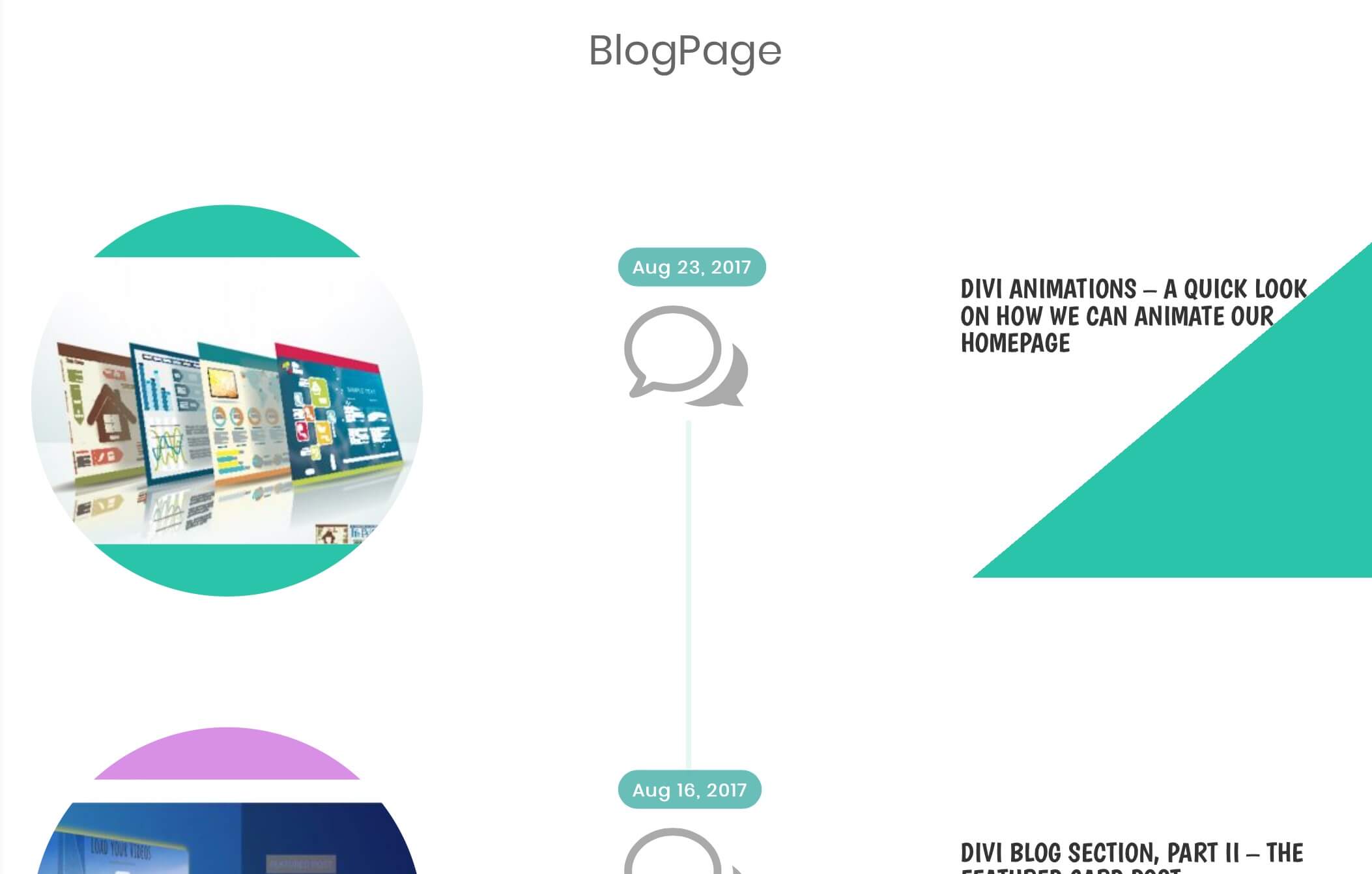
 Today we are diving into the third part of our series Divi Blog Section. We have already seen how to create a nice secondary three-column section on our homepage and how to add also a featured post with a nice animated blog card style. Now we pass to the Blog Page as...
by
Dan Mardis
| Aug 23, 2017 | Css, Interaction, Snippets
 Today we talk about Divi Animations. The argument, of course, is really wide and in this post we want to cover just a little of it, going to explore how we added a touch of animation to our Divi Blog Card on homepage. Thus, here we are only at Part I of this Divi...
by
Dan Mardis
| Aug 16, 2017 | Css, Design, Featured, Snippets
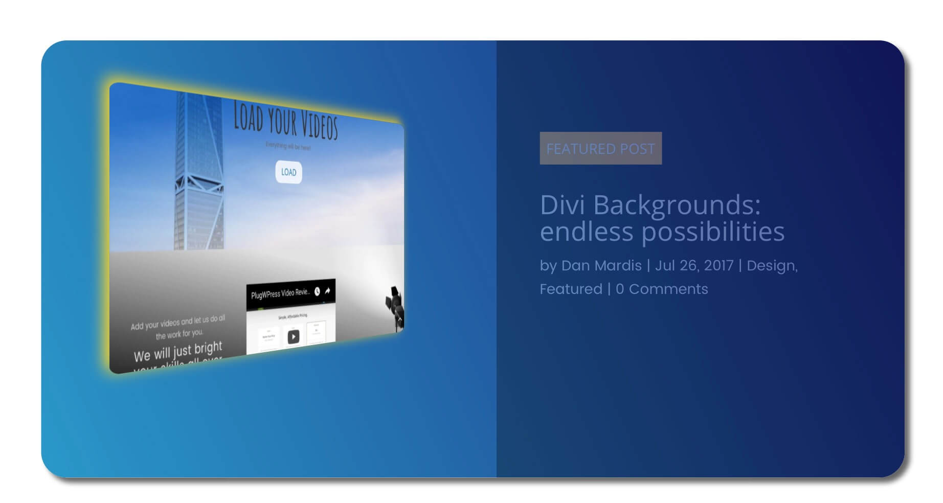
 Hey everyone, today we will see another Divi Blog idea with our second Divi Blog Section appointment. In the first post of the series we have seen how we set up the shaped blog section on homepage playing with clip-path css on hovering the three-column blog layout....
 Today we want to focus on a little useful design element we have used for the first time in our last post. We are talking about a simple Divi Toggle module that will serve us as toggle tip element for suggesting the user possible issues or ideas. Our final result,...

