by
Dan Mardis
| Jan 26, 2018 | Css, Design, Featured, Interaction, jQuery, Snippets
 Hi everyone, last friday we saw how can we work with a great css property like the clip-path one in order to get a standing-out-of-the-crowd effect. Today we are going to create a similar transition effect between two sections (or also between modules if you want)...
by
Dan Mardis
| Jan 23, 2018 | Css, Design, Php, Snippets
 Today we are going to get back on our Blog page to put our hands on design and functionality. So we already set our main ‘blurbing timeline’ section at the top of the page for the desktop devices only and this one is working fine. But the section below...
by
Dan Mardis
| Jan 20, 2018 | Css, Design, Interaction, jQuery, Snippets
 Hi everyone, today we continue our journey into the world of section dividers but this time we want to deep the css clip path topic and see how this can work for our purposes. So let’s get started! THE CLIP-PATH CSS PROPERTY The clip-path css property is a magic...
by
Dan Mardis
| Jan 12, 2018 | Css, Design, Snippets
 Hi everyone, today we go with the second post of our Divi Series Css Section Dividers and Transitions. We talked about the Triangle one in the first Series post, and now we want to go deep into the second kind of divider: the half circle one and all its potential...
by
Dan Mardis
| Dec 29, 2017 | Css, Design, Snippets
 Hi everyone, today we start a new series about the css dividers and transitions we can make on Divi between a section and another, or also a row/module and another. So let’s get started with the first post of the series about the Triange (asymmetric) one, just...
by
Dan Mardis
| Dec 8, 2017 | Css, Design, Divi Layouts, Snippets
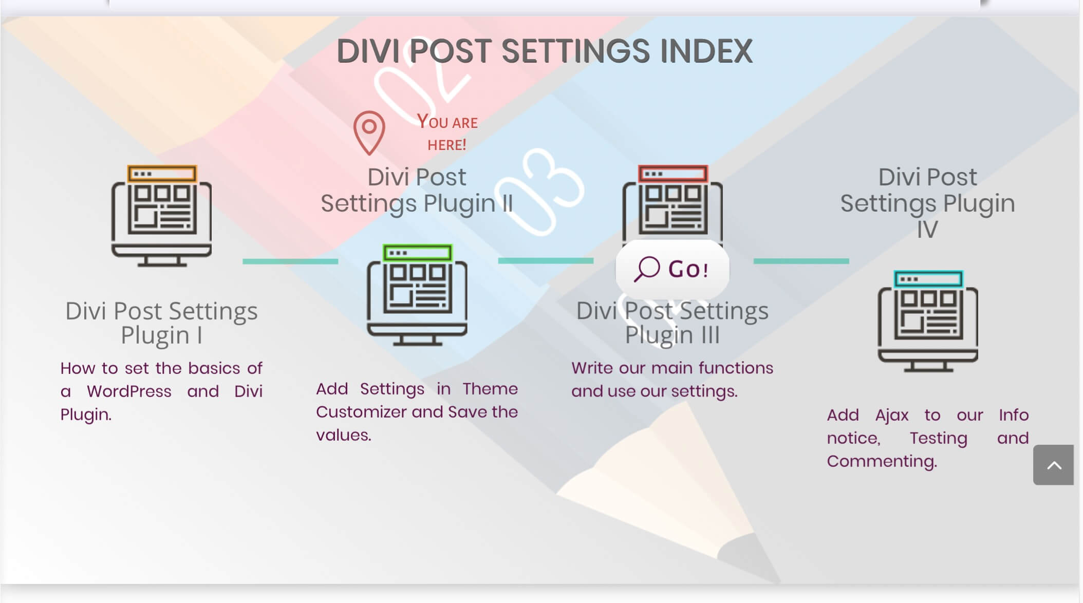
 Hi, today we want to share with you the design layout we created in Divi for our Divi post Series indexes. It is a simple way for orientating the visitor among the Series posts giving him an overview of the topics of every post and a direct link to them. So, without...
 Hi everyone, last friday we saw how can we work with a great css property like the clip-path one in order to get a standing-out-of-the-crowd effect. Today we are going to create a similar transition effect between two sections (or also between modules if you want)...


